The Story of Metro Nova
The story of how I helped (in a small way) create a new version of Metro with all its original personality
Published: 1 Feb 2021
Topics: Typography, Linotype, Film, Writing
TL;DR: When people ask me “What is your favorite font?” now I can point them to this blog post
Accidental Discovery
The year was 2011 and we were filming at the Museum of Printing in North Andover, MA. It was February, there was snow on the ground, and the building’s boiler heating system was broken. Inside the building it was so cold that all of us in the film crew were wearing winter jackets and hats, trying to stay warm.
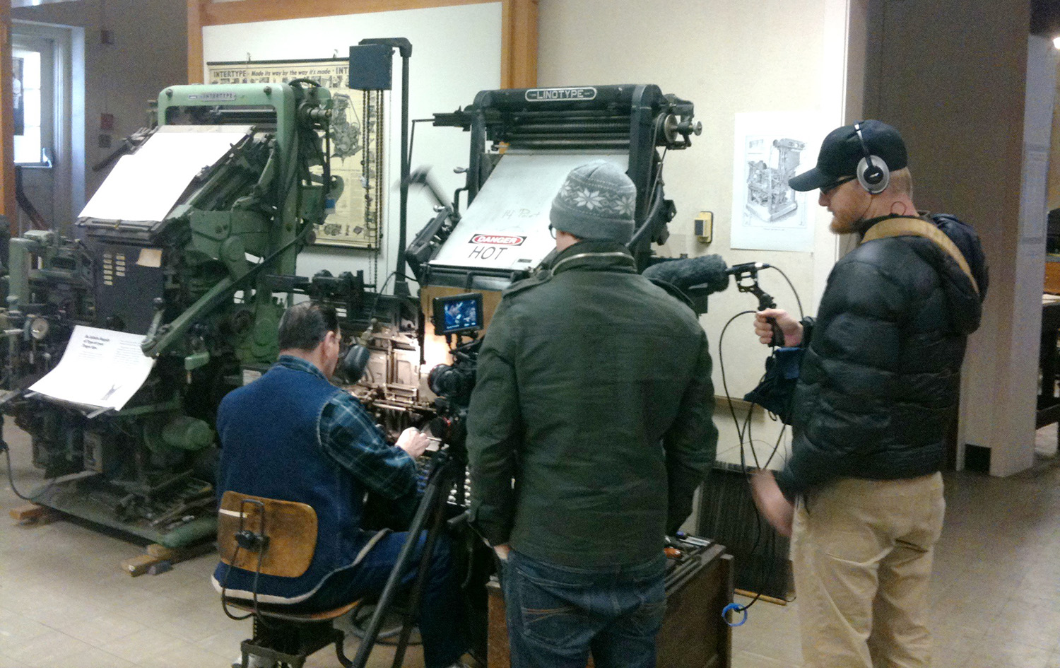
We were interviewing Linotype historian Frank Romano for Linotype: The Film along with Glenn LeDoux and operator Ray Des Champs. After filming, Frank took us into attic of the building to show us the stacks of the Mergenthaler Linotype drawing archive.
When Frank opened the door, there before us were over 1,000 black boxes (about 15" x 15" in size) with technical drawings for every typeface made for the American Linotype machine. Out of curiosity, I randomly grabbed a box off of the shelf labeled “Metroblack” and opened it up.
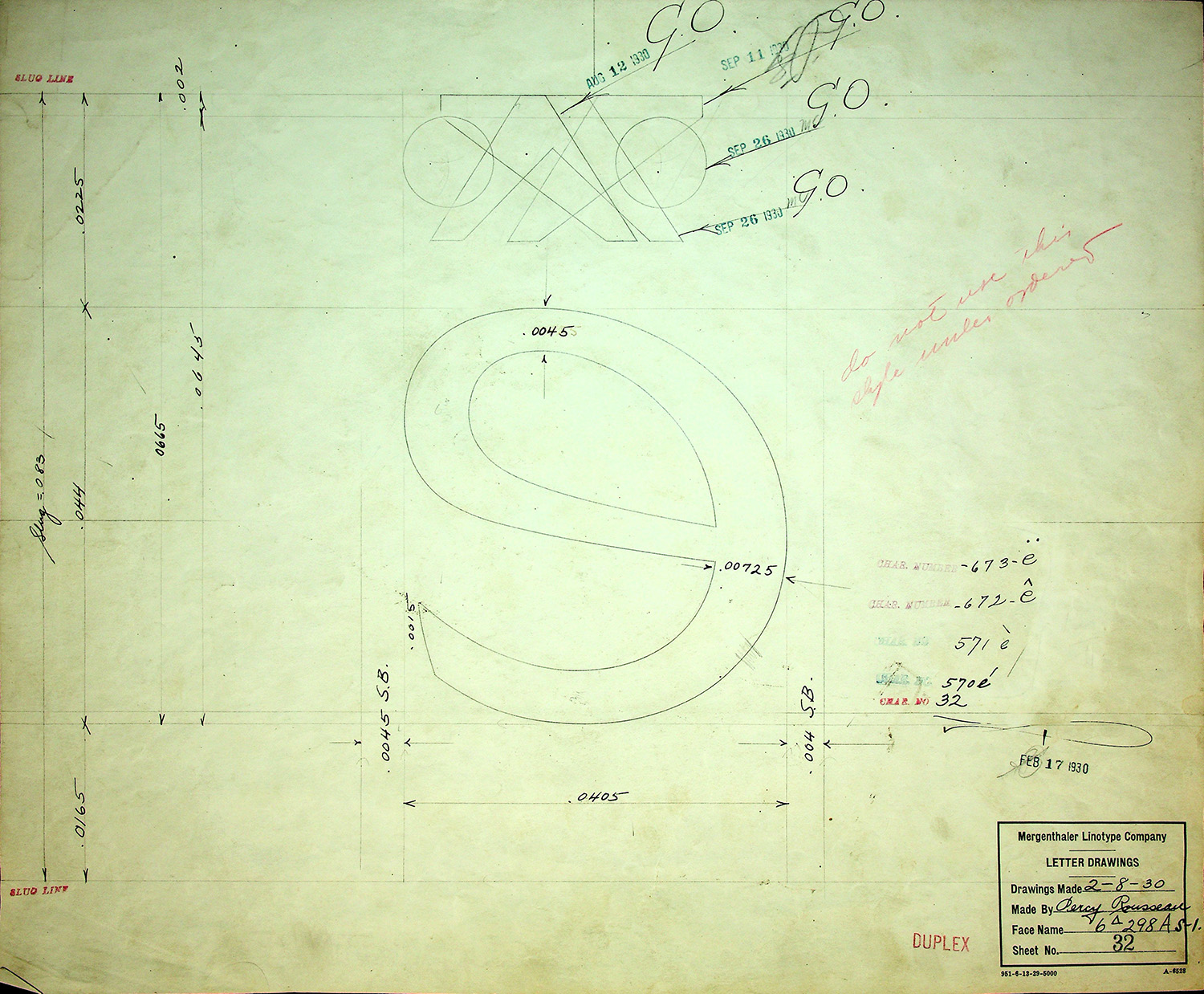
Inside, the drawings were in sorted in alphabetical order, so naturally I saw a capital A as the first drawing. I recognized the design of the character, but the top (or apex) of this cap A was not what I was expecting from the Metro that I thought I knew.
Instead of a sharp, pointed top, I saw a slanted apex with a great sense of style. Confused, I closed the box to double-check that I had picked up Metro and not something else.
Unbeknownst to me, I had just found the drawings for the original Metro typeface and this started me down yet another typographic rabbit hole (I seem to be pretty good at falling down every one I encounter).
Customer Demands & the Development of a Typeface
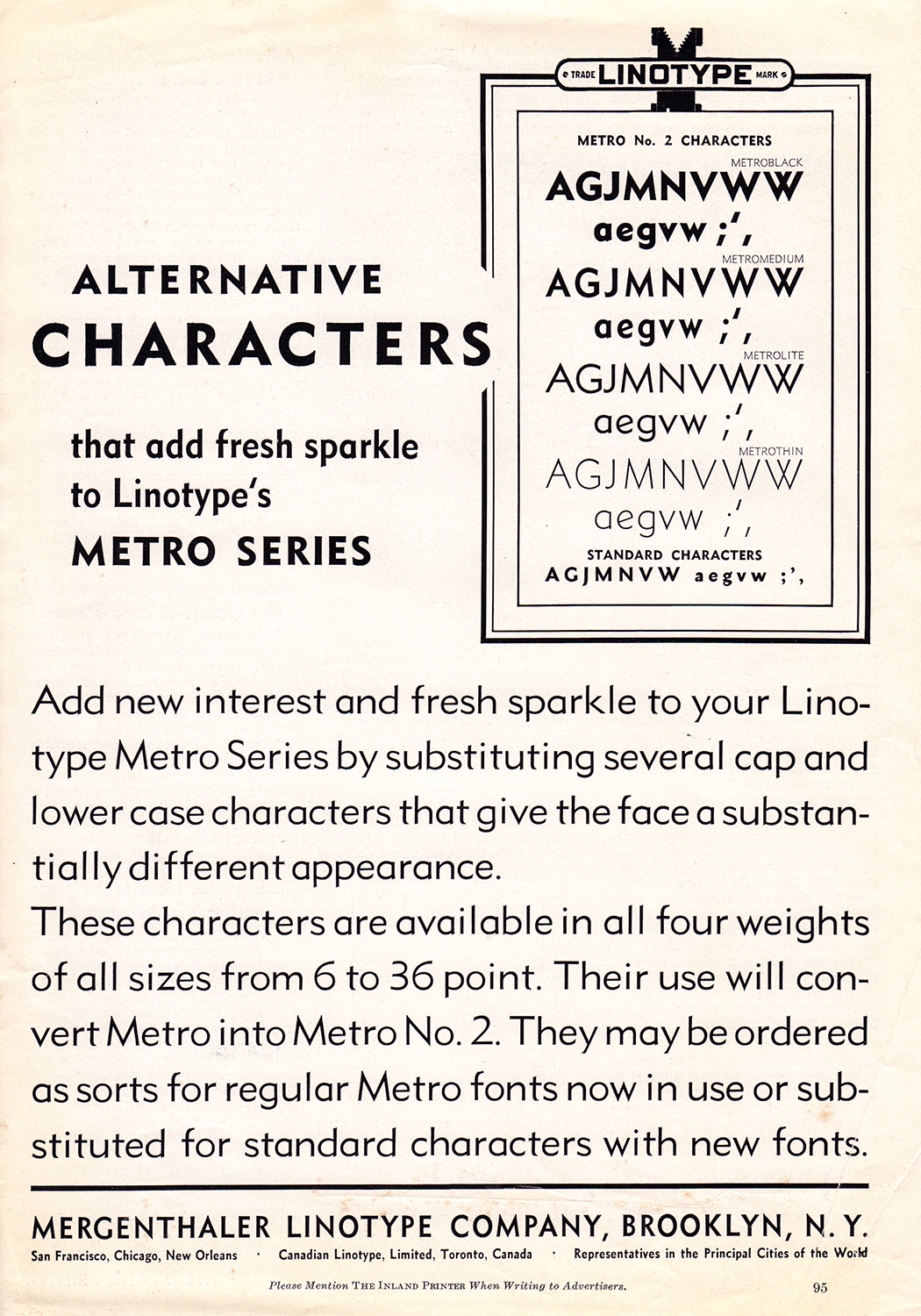
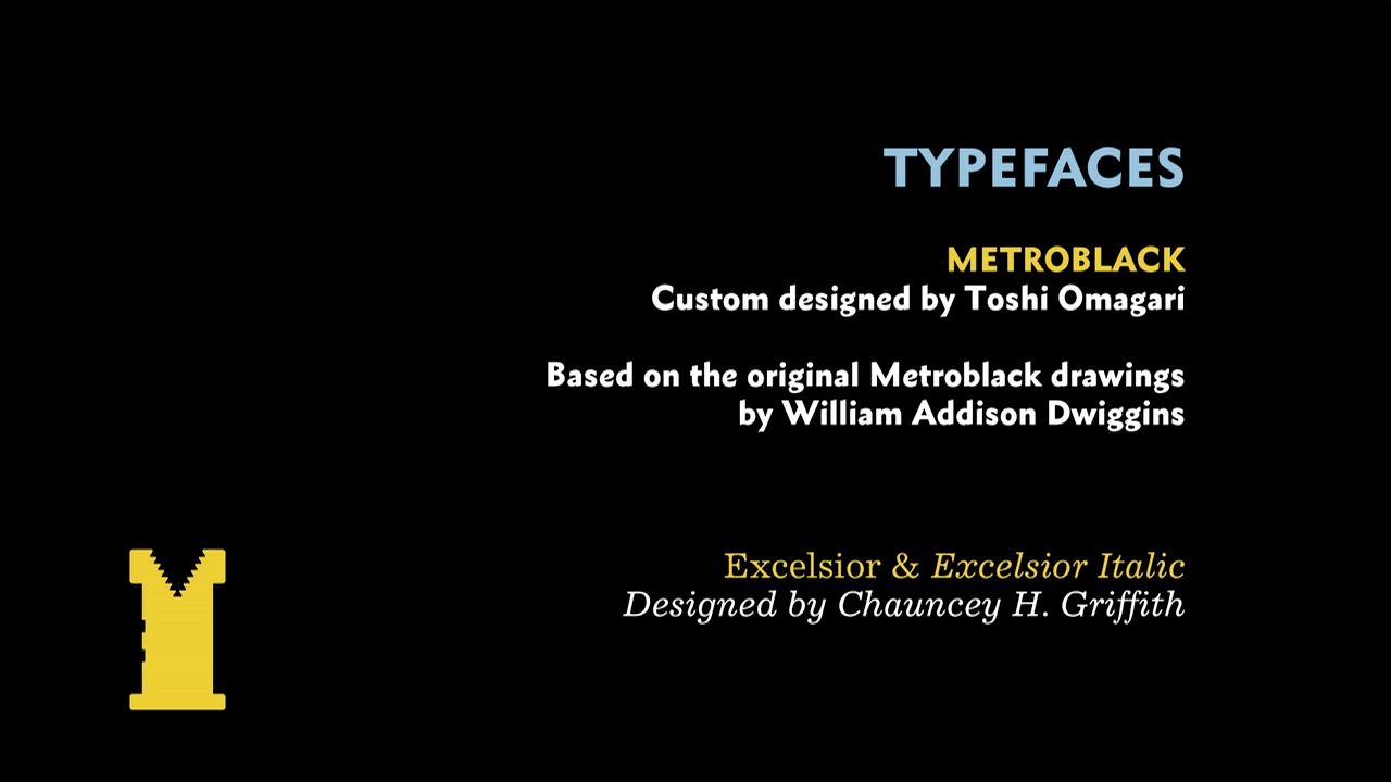
After researching through my old Linotype specimen books, I learned that Metro was first drawn by William Addison Dwiggins and released in 1929. The first two styles, Metroblack and Metrolite, had wonderful characters such as the A G J M N V W a e g v w which were much more playful and less geometric than other modern san serifs.
After its inital release, there was customer feedback demanding something “more European and modern” in the style of Futura, Erbar, Kabel, et. al. Bowing to this pressure (and possibly low initial sales?) Linotype asked Dwiggins to redesign these characters to be more like the other competitors.
Now the A G J M N V W a e g v w characters became the “pointy characters” that most people associate with Metro. Gone was the stylish cap A that I had seen at the Museum. These updated characters became alternates that customers could order and eventually, Metro was rebranded as “Metro No. 2,” which was released a couple years later.
(If you really want to learn more, grab a snack and read Paul Shaw’s insanely in-depth article on the evolution of Metro.)
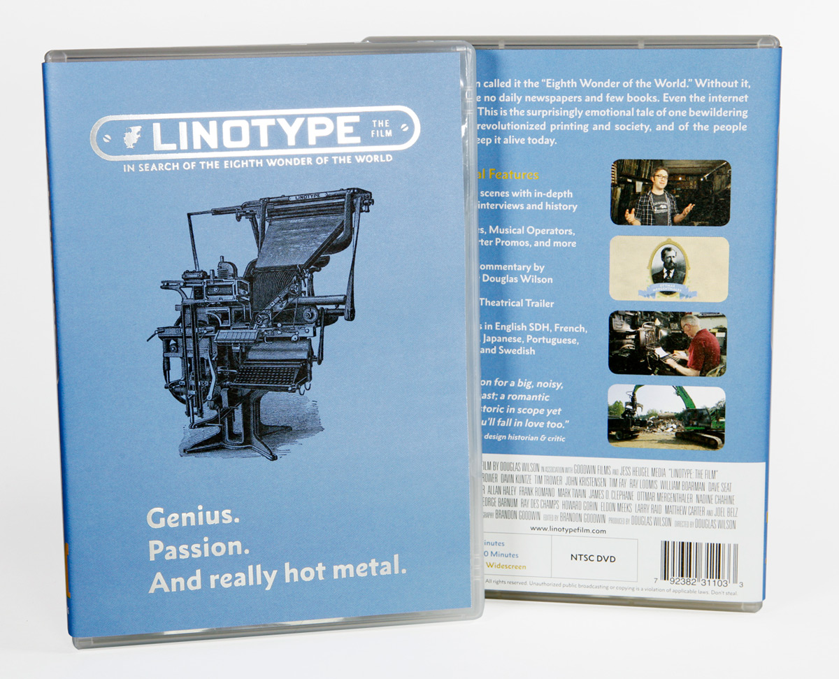
Doing further research, I was disappointed to discover that all modern digitizations were based on Metro No. 2 and, in my opinion, lacked any of the personality from the original designs. Immediately, I knew that I wanted to use a digitized version of the original, quirky design for the film titles and DVD packaging, but how?
Something Old, Something New
Enter Dan Rhatigan into the story. Dan was the Type Director at Monotype UK at the time. I had met him in London when I was giving presentations about the history of the Linotype for a few Monotype events.
I asked if it would be possible to get a single font made based on the original Metroblack designs and if he knew of a good type designer that would be willing to do it. Without hesitation, he suggested type designer Toshi Omagari.
If I remember right, Dan said that Toshi was a madman-type-design-robot-that-never-slept-and-worked-super-fast—which was not too far from the truth! Dan asked Toshi to design the characters in his spare time and he took on the challenge.
The next time I saw them both in London, Toshi had not only made a digital version of Metroblack true to the original for the purposes of the film, but he had taken it upon himself to start reviving the entire Metro family.
We sat under a stairway looking at Toshi’s designs on his laptop and all three of us got really excited. Dan said he would propose to the German Linotype company (which was owned by Monotype, but still called Linotype at the time) that they turn this into a full typeface release.
Thankfully, Linotype agreed and gave Toshi time to build out the full family. Toshi brought insight and invention into capturing the spirit of Dwiggins’s orignal designs and building a modern type family. He evened-out the weight distribution, normalized some of the most quirky characters, and added additional styles.
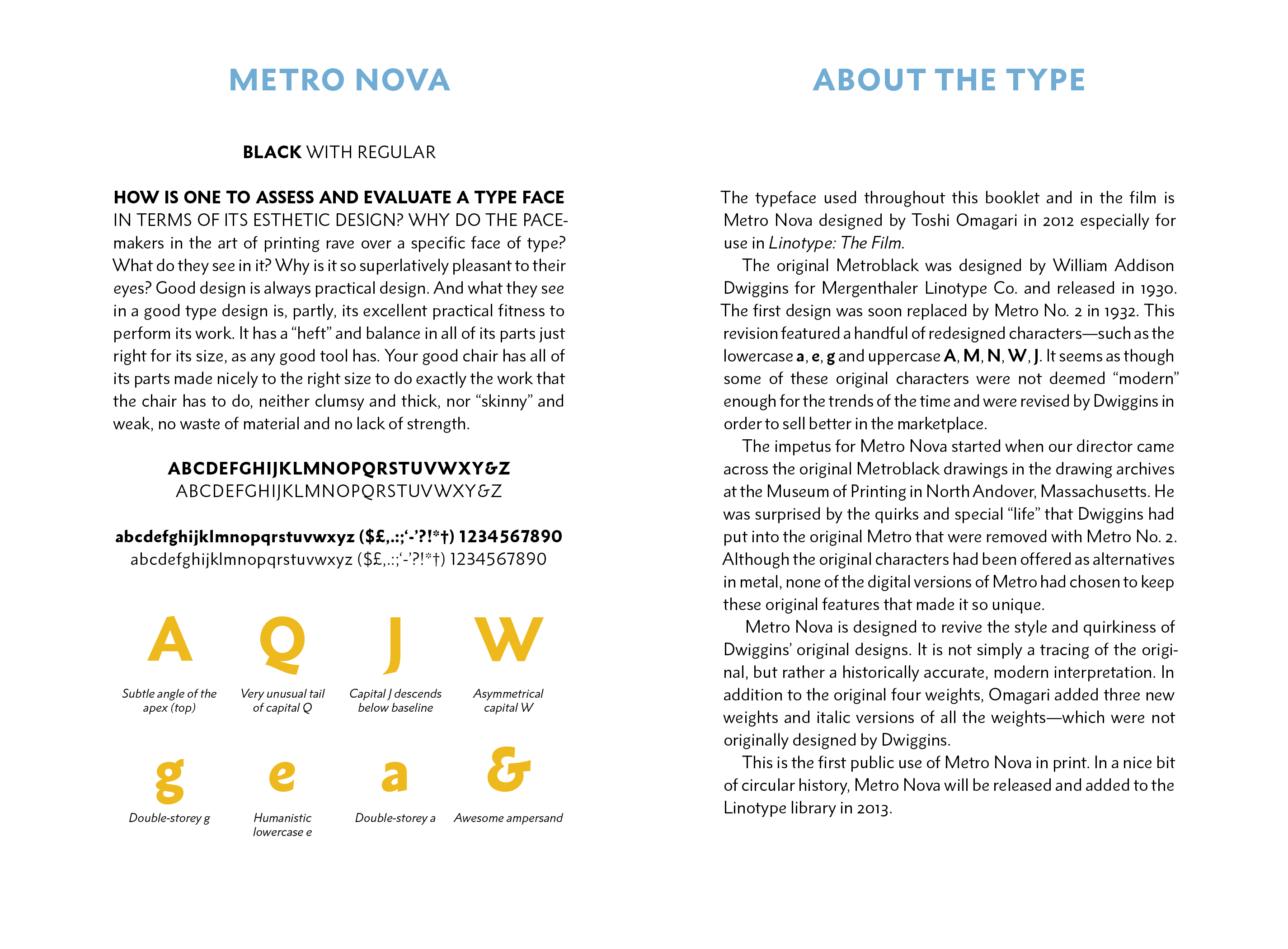
In October 2012 we released the film, which was the first public use of Metro Nova in print inside the DVD booklet. A few months later in 2013, Linotype officially released Metro Nova to the world.
Monotype’s marketing would later say that Metro Nova was “rescued from obscurity” by me, which is far too hyperbolic, but to have played a small part in the creation of Metro Nova is one of my proudest accomplishments.
If you would like to read more about Metro Nova, you can still download the promotional PDF.
What You’re Currently Reading
Part of the genesis of launching my blog was to prove that Metro Nova is not only a good large-display typeface, but also incredibly nice to read in body copy and for long-form reading.
And so, you’re reading Metro Nova Regular and italic right now. With a bit of finesse, I think that it gives the perfect balance of personality and readability and feels just right for my blog. I hope you agree.