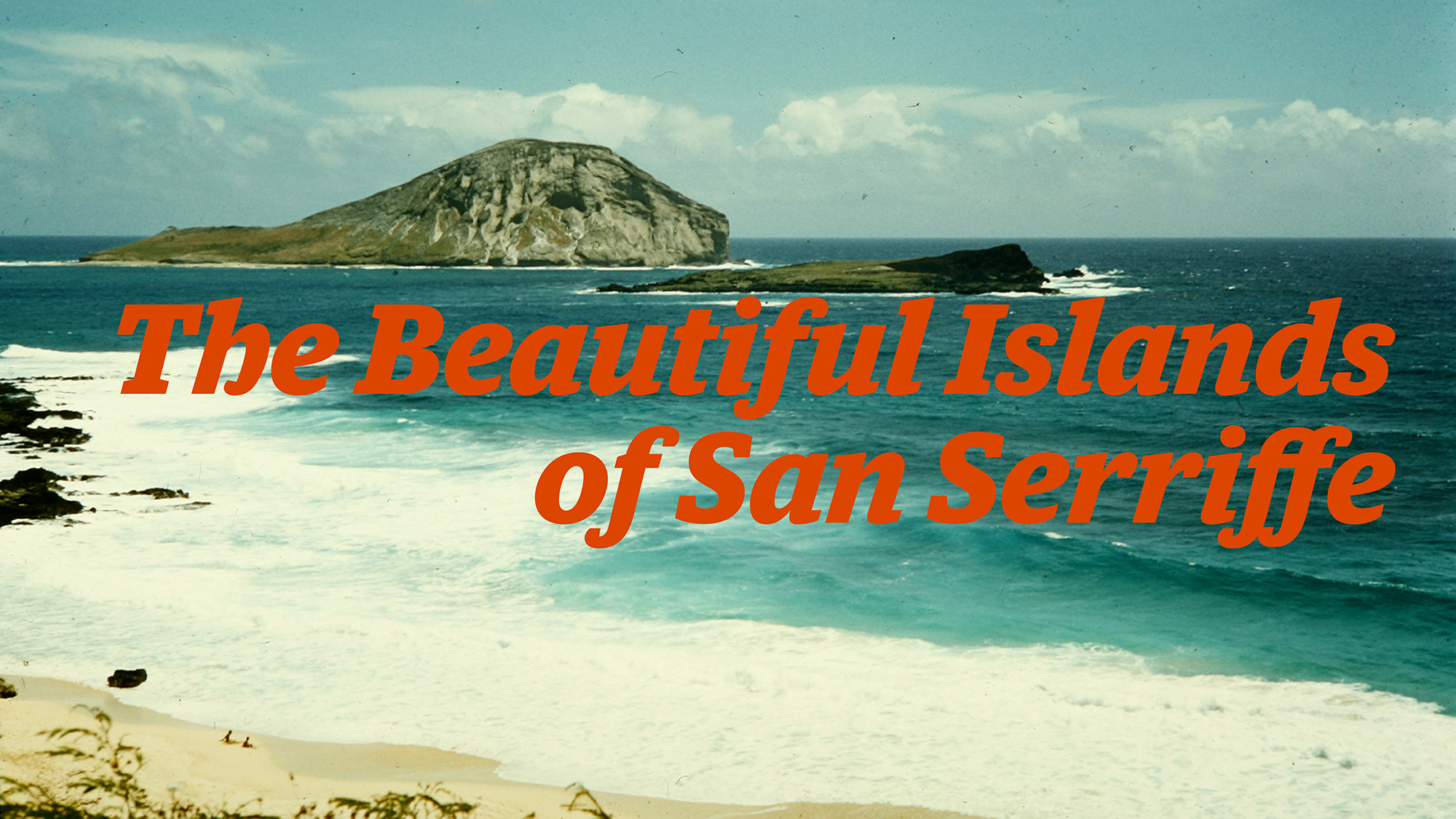
The Beautiful Islands of San Serriffe
The story of the most elaborate April fool’s joke ever printed
Published: 20 Jun 2016
Topics: Typography, Presentations, Travel
TL;DR: Some printers at a newspaper in the UK made a funny joke about fake islands
A Morning Like Any Other
The morning of April 1st, 1977 started as a typical day in the United Kingdom. The Guardian newspaper was delivered to thousands of homes across the nation and people woke up to a quintessential early-spring weather forecast of “Outbreaks of rain, with some bright intervals.”
The front page of the paper gave the news of the day including the collapse of negotiations between the Soviet Union and the United States as well as the fact that “Pubs ‘charge too much’” if you order soft drinks instead of a lager. There was even an editorial cartoon debating if the EuroVision song contest should go ahead some things never change, it seems.
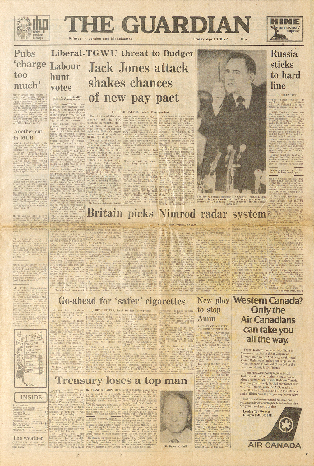

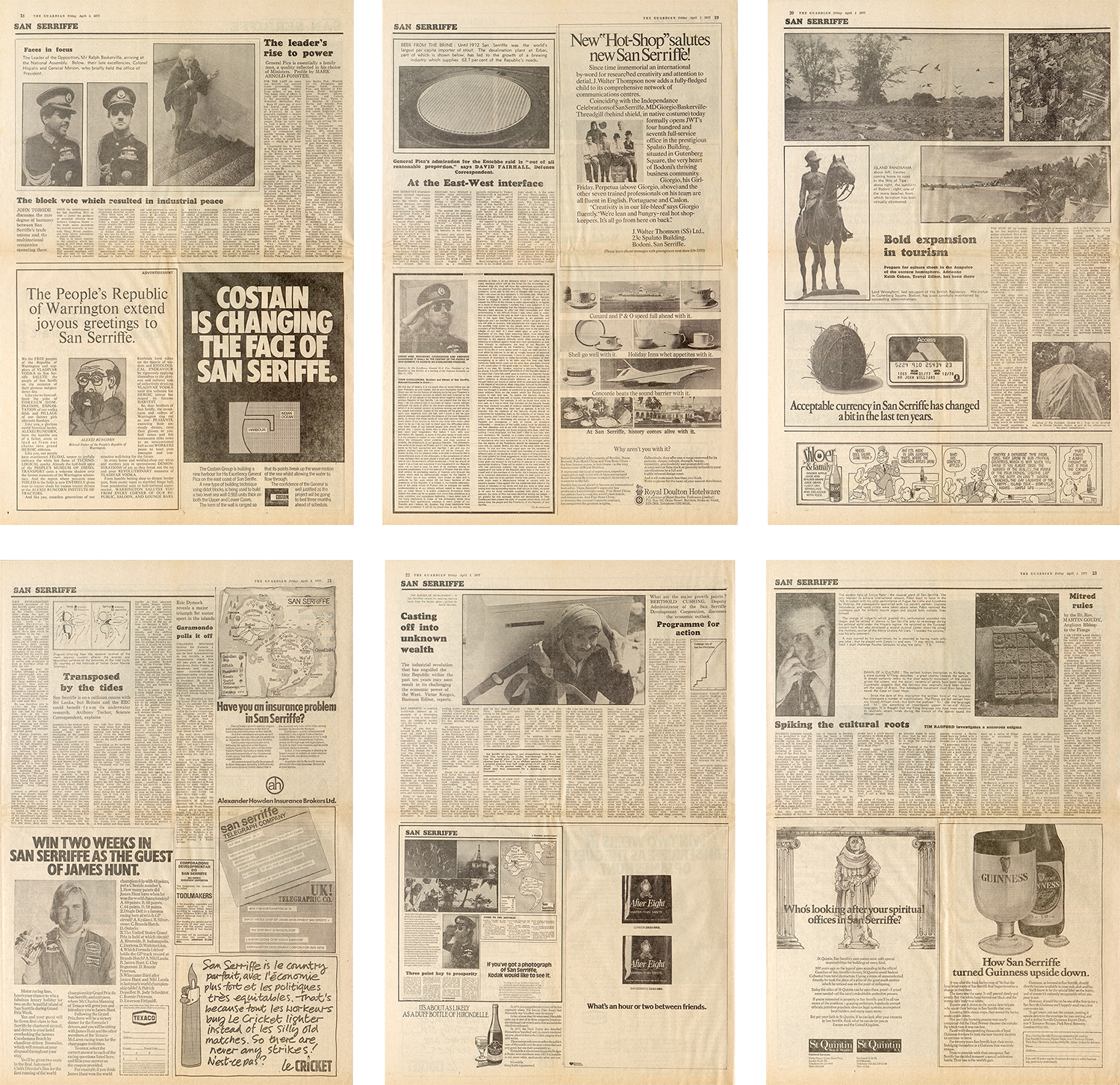
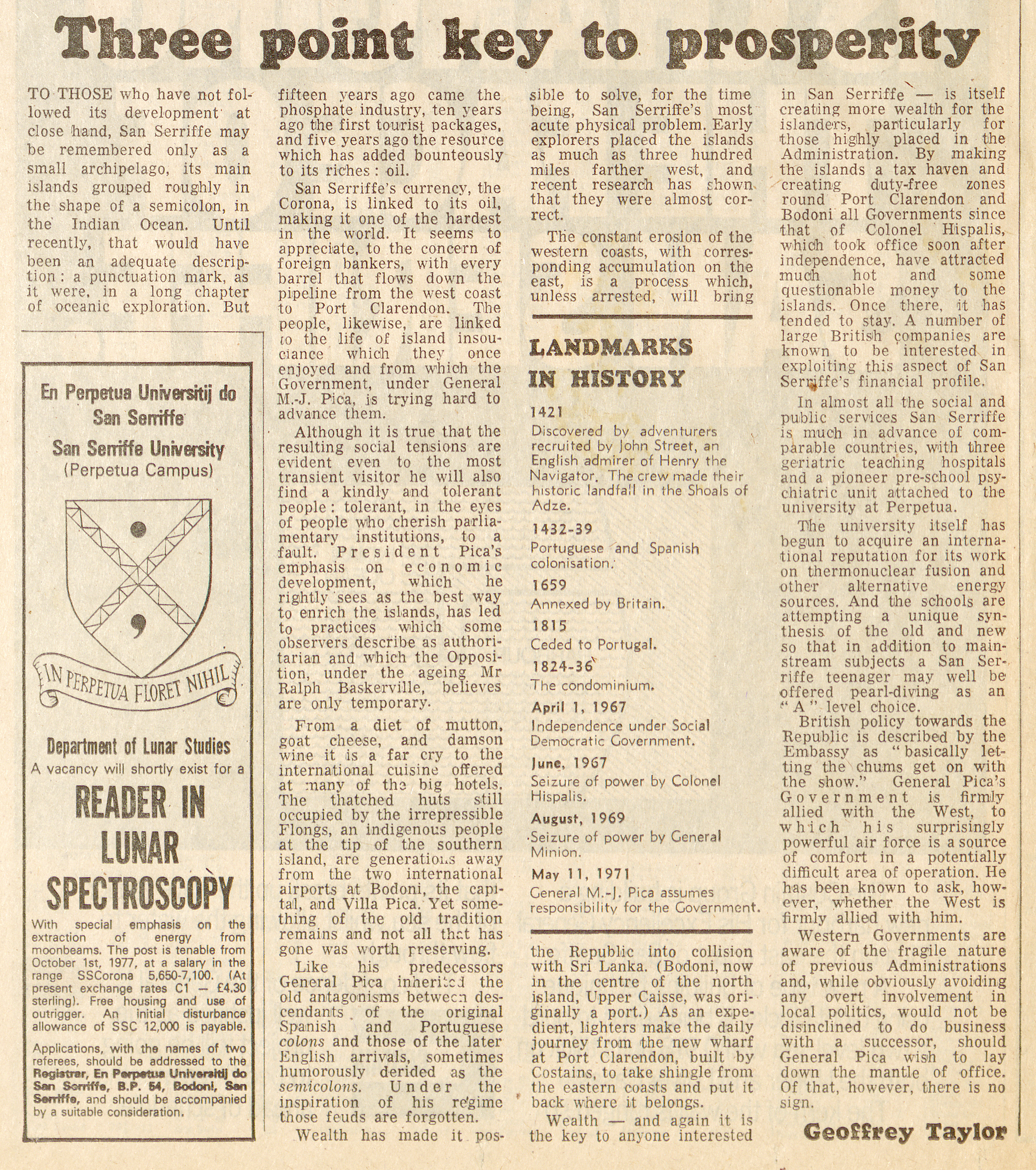
Inside, the newspaper elaborated on topics of international and local interest and most readers would not have noticed anything unusual about a special travel feature starting on page 17 of the paper.
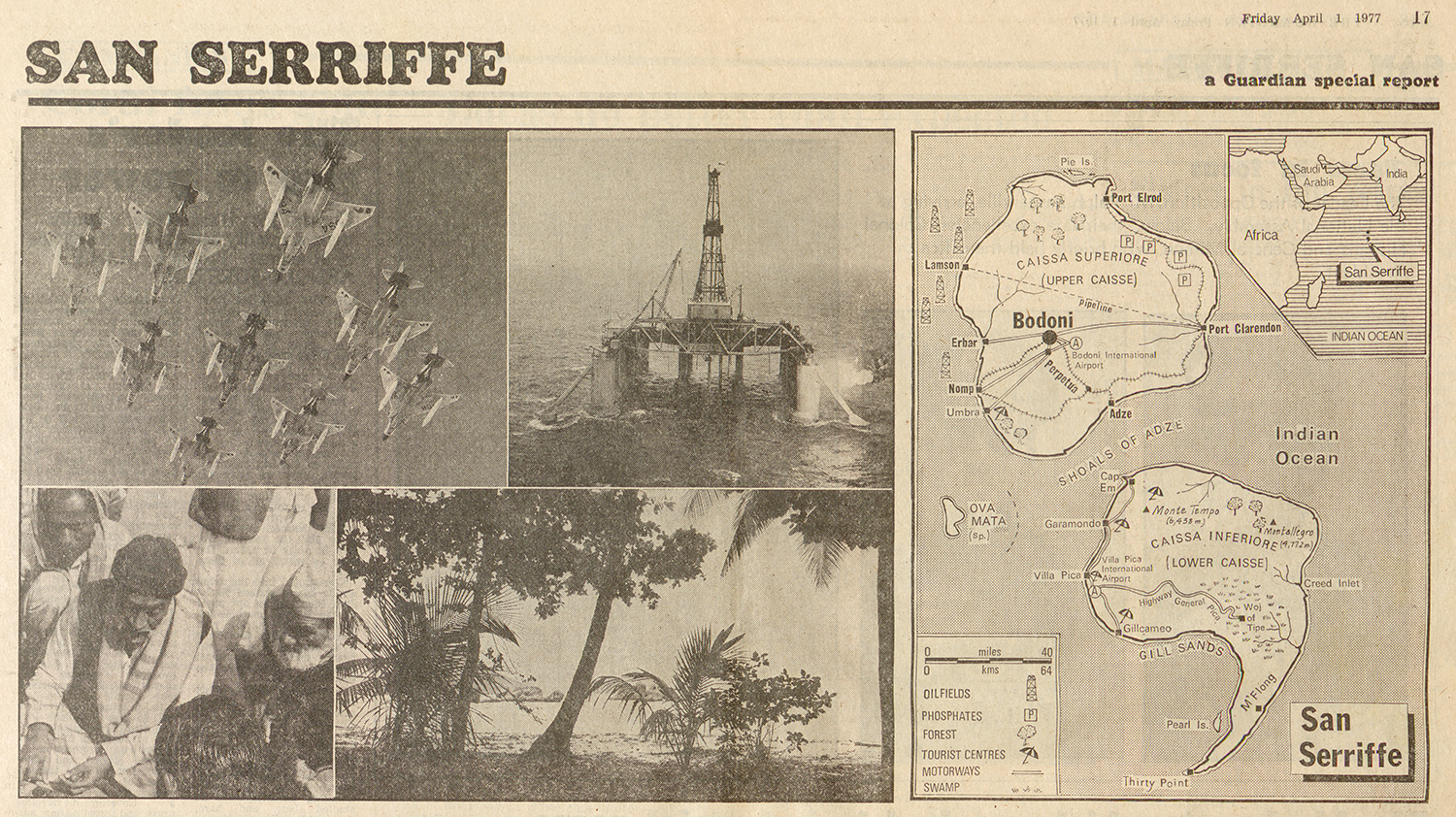
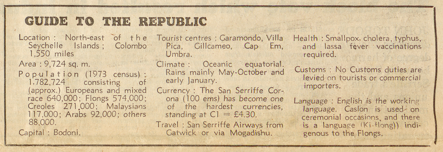
The seven-page like any travel feature that newspapers were printing at the time. It featured a map of the islands, pictures of palm trees, an image of the leader, and a short “Guide to the Republic” which gave many facts and figures about the island nation.
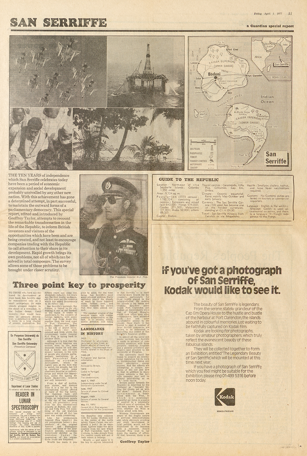
“But not all was as it seemed. The feature was an elaborate April Fool’s Day joke. The islands of San Serriffe did not exist and everything was completely fabricated.”
Fast Facts About San Serriffe
- Location: Halfway between Africa and India in the Indian Ocean
- Population: 1,782,724
- Capital: Bodoni
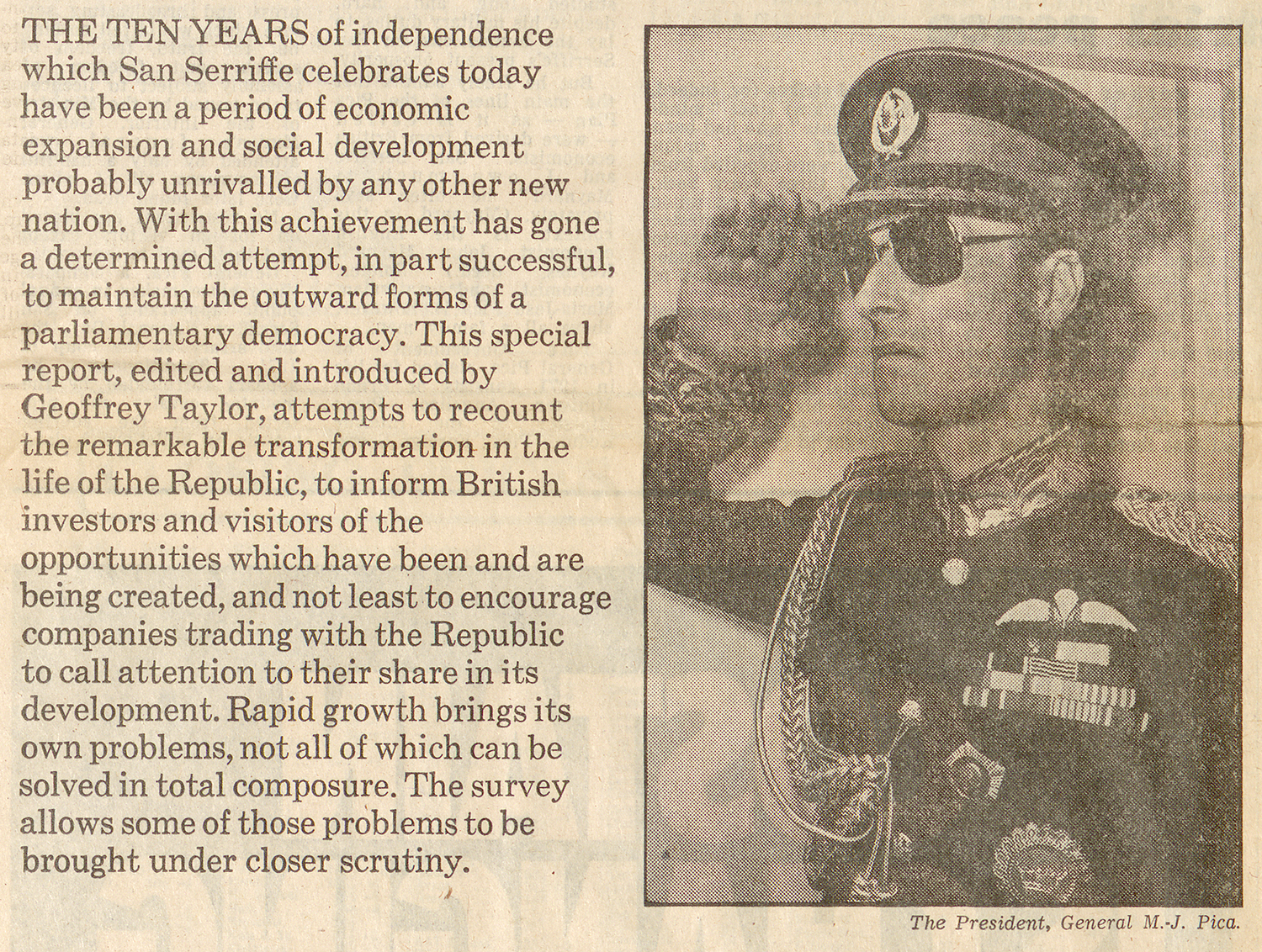
- President: M. J. Pica
- Tourist Centres: Garamond, Villa Pica, Gillcameo, Cap Em, Umbra
- Currency: San Serriffe Corona (100 ems) C1 = £4.30
- Language: “English is the working language. Caslon is used on ceremonial occasions, and there is a language (Ki-flong) indigenous to the Flongs.”
Printer’s Puns and Jokes
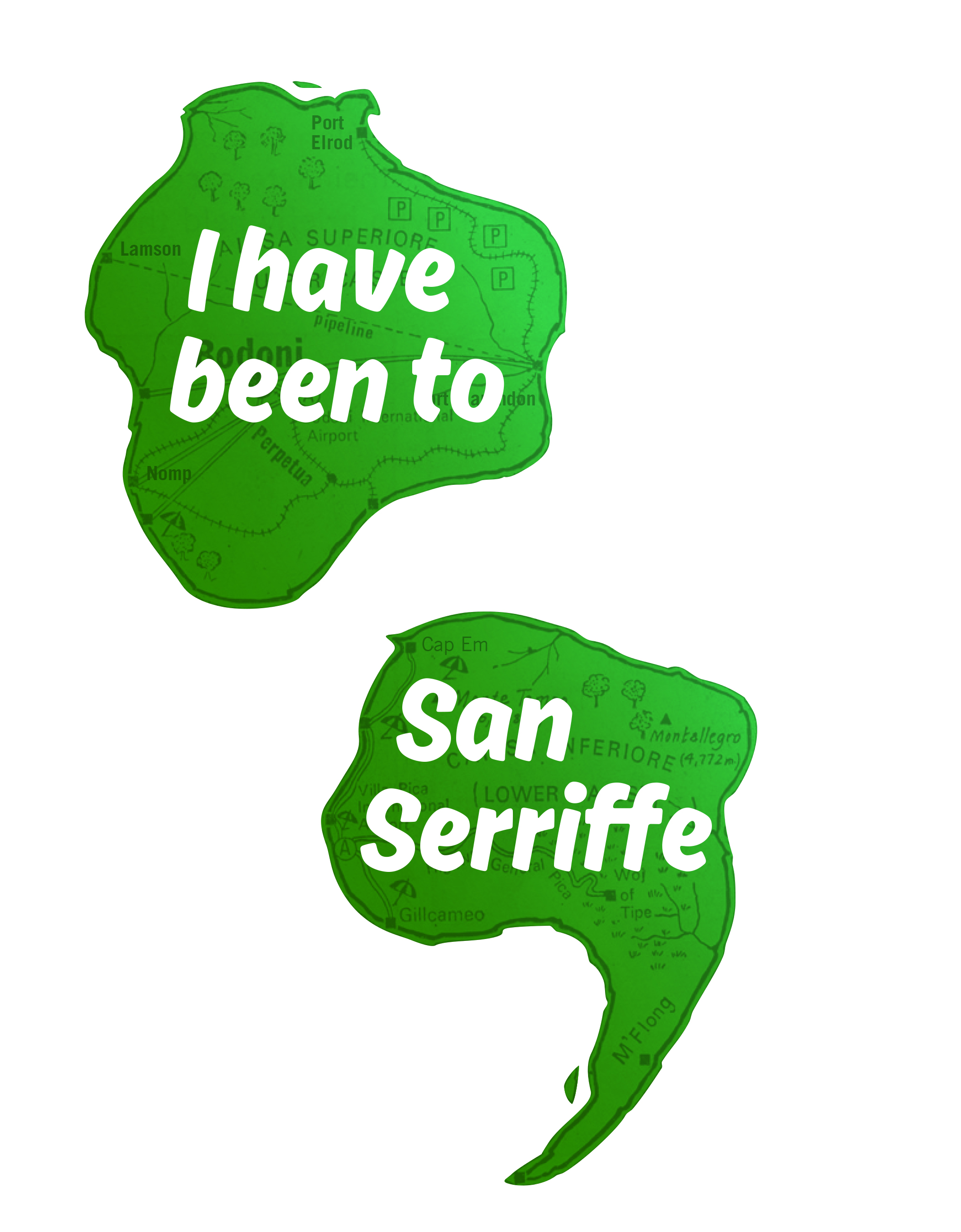
Many of the articles and advertisements were based upon “inside jokes” that only printers and aficionados of typography would have understood. From the shape of the islands to the names of cities, typographical terms and typeface names were used liberally to give names to geographical places and demographic facts.
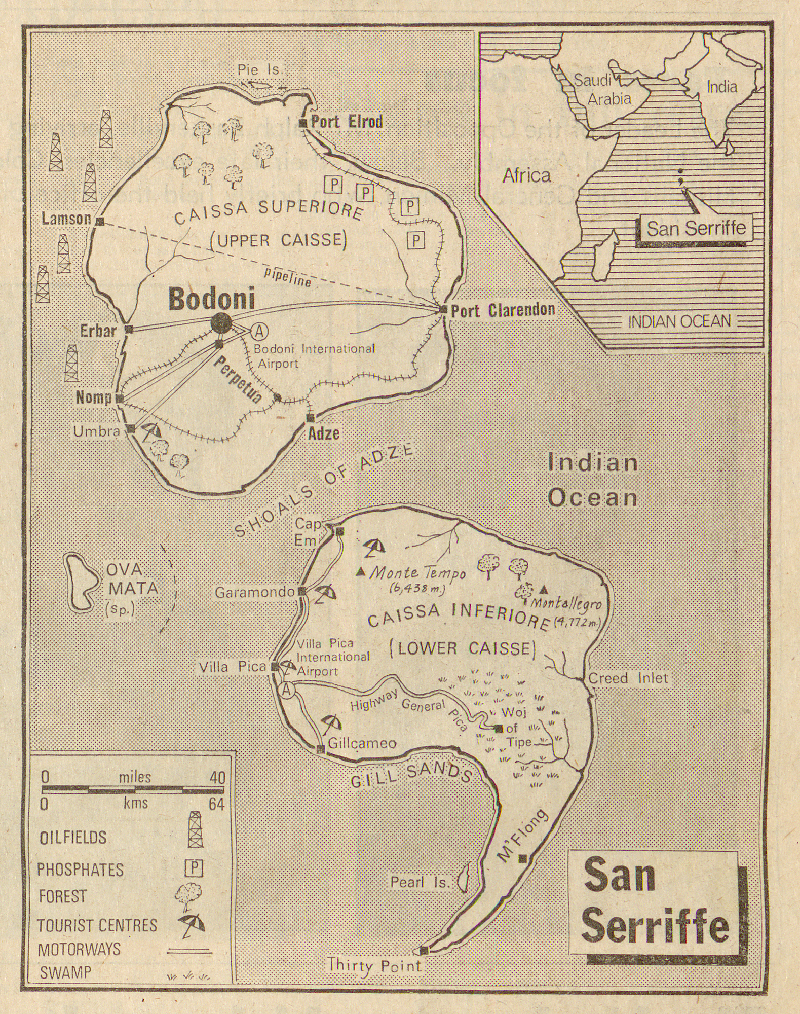
- Island Name: San Serif typeface (without serifs)
- Island Shape: Semi-colon, Upper Caisse & Lower Caisse
- Pie Island: When you drop letterpress type on the ground
- Port Elrod: A hot-metal strip-casting machine
- Typefaces: Port Clarendon, Bodoni, Erbar, Perpetua, Umbra, Garamondo, Gill Sands, Gill Cameo, Monte Tempo, Montallegro
- Ova Mata: Type that does not fit in a column (also called “over set”)
- Woj of Tipe: “Wodge of Type” A bulk quantity of type
- Printing Terms: Villa Pica, Pearl Island, Cap Em, Thirty Point
- Flong: A curved papier-mâché matrix which helped create stereotype plates for rotary press printing
A Strange Land Indeed
On the surface, many of the articles appeared normal if you quickly flipped through the newspaper. There were articles about the political history of San Serriffe, the influx of tourism to the small islands, and potential economic opportunities for businesses looking for new territories.
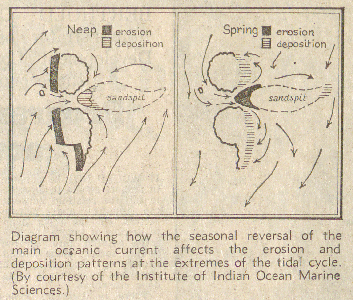
This scientific article about how the ocean tides effect the islands seems completely plausible — until you read the details and see the scientific diagram which supposedly explains how the islands will eventually collide with Sri Lanka in 2011.
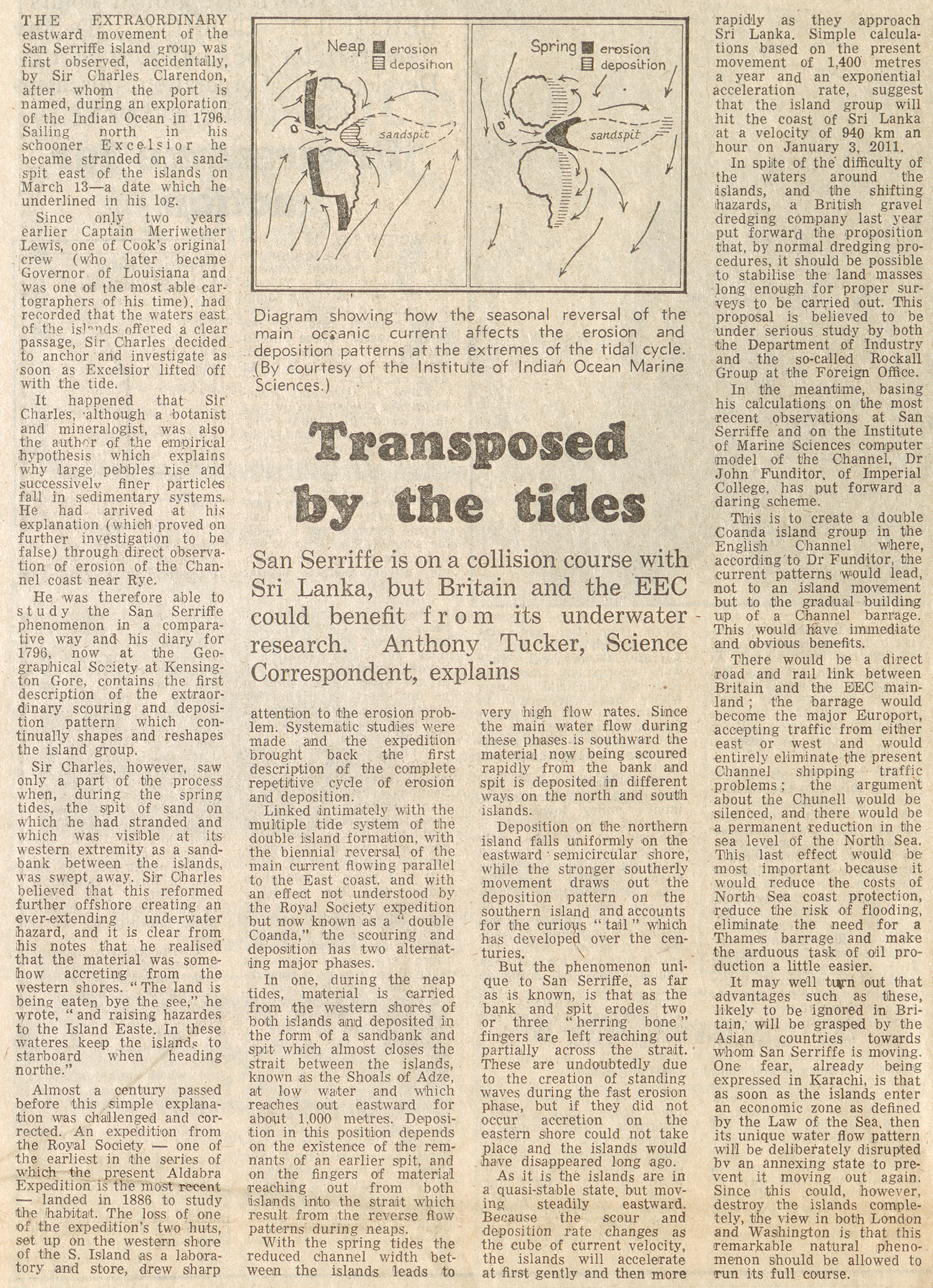
“… the islands will accelerate at first gently and then more rapidly as they approach Sri Lanka. Simple calculations suggest that the island group will hit the coast of Sri Lanka at a velocity of 940 km an hour on January 3, 2011.”
The Advertisements
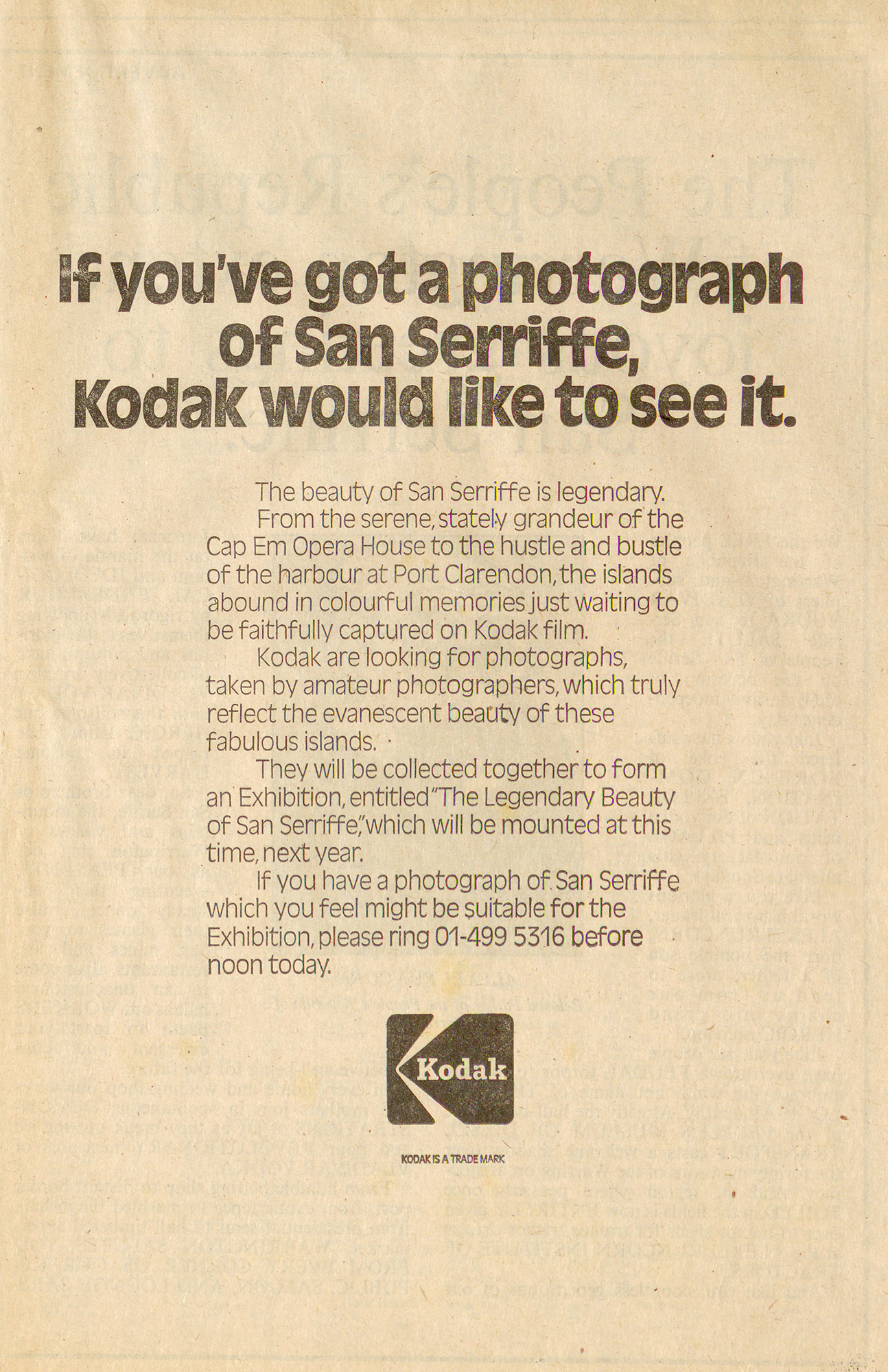
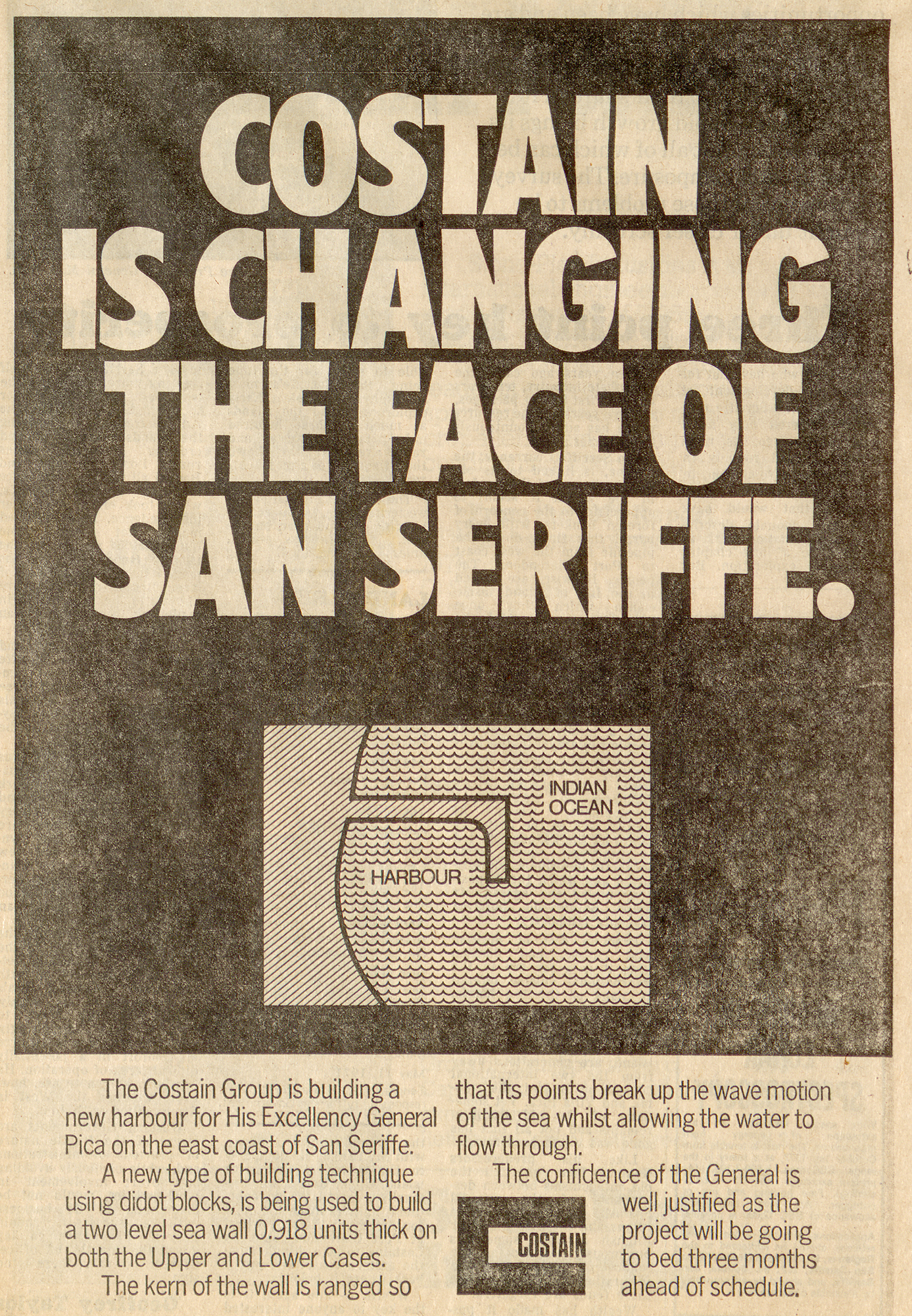
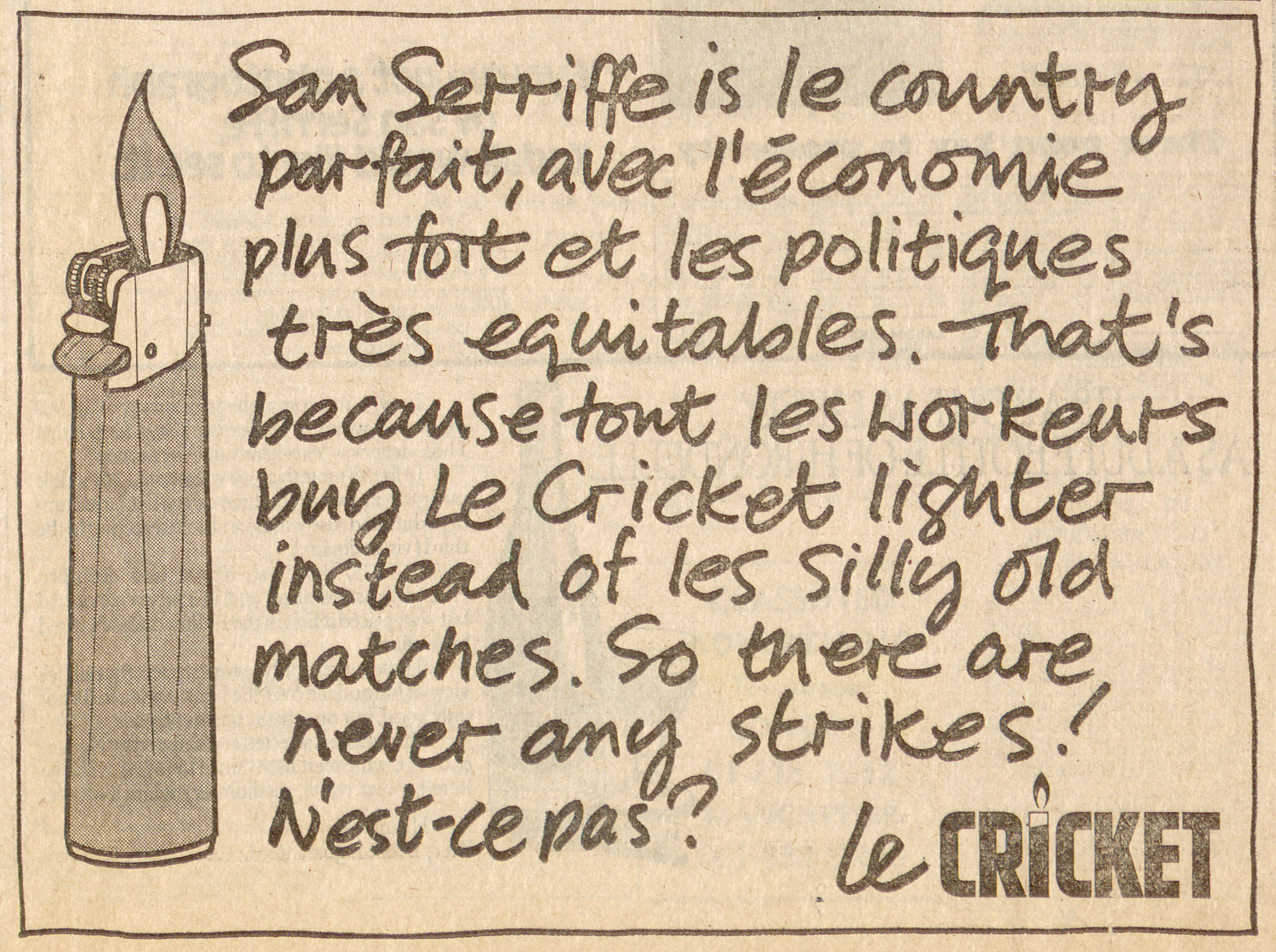
What made the islands of San Serriffe seem most plausible were the advertisements placed throughout the feature from large brands such as Kodak, Texaco, Costain, and Guinness. These ads, with complete approval from the companies, became critical in making it more believable — until you read the fine print.
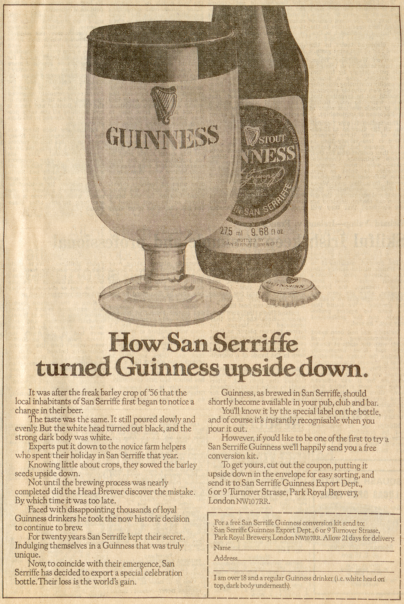
“It was after the freak barley crop of ’56 that the local inhabitants of San Serriffe first began to notice a change in their beer. The taste was the same … but the white head turned out black, and the strong body was white.
Experts put it down to the novice farm helpers who spent their holiday in San Serriffe that year. Knowing little about crops, they sowed the barley seeds upside down.”
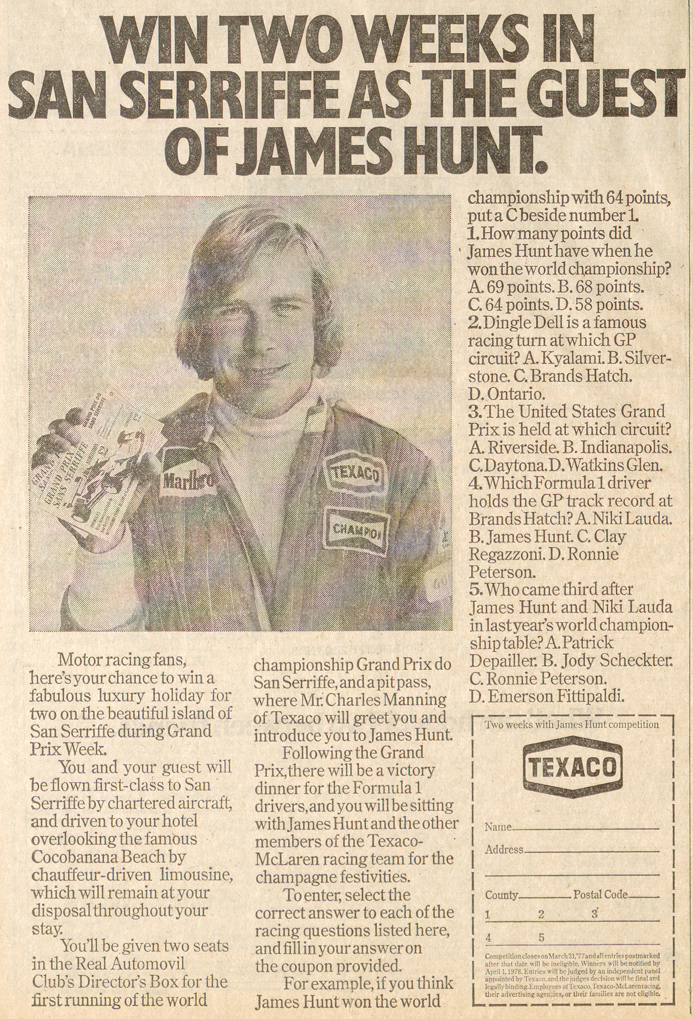
“You and your guest will be flown first-class to San Serriffe by chartered aircraft, and driven to your hotel overlooking the famous Cocobanana Beach …”
“Competition closes on March 31, 1977 and all entries postmarked after that date will be ineligible.”
How did one of Britain’s Largest Papers Get Away with Such an Elaborate Prank?
According to The Guardian Book of April Fool’s Day published in 2007, the idea for San Serriffe come about as a joke in itself:
“The Financial Times was always doing special reports on little countries I’d never heard of … I was thinking about April Fool’s Day 1977 and I thought, why don’t we just make a country up?”
Special reports editor Stuart St. Clair Legge suggested the title that was to become a legend: San Serriffe, part typographic pun, part credible name for a tropical isle.
The feature was originally envisioned as an one-page story but the editors kept coming up with ideas and expanded it into the largest travel supplement in Guardian history. At this point, the newspaper was still printed using hot-metal typesetting and the production of a single page required an enormous amount of time and resources — let alone setting seven full pages just for a joke.
The People Behind the Joke
The people behind the story were all regular employees or contributors to The Guardian.
- Philip Davies was an advertising representative who came up with the idea for a fake island.
- Geoffrey Taylor was the foreign editor who created editorial content and designed the fake islands.
- Stuart St. Clair Legge, a special reports editor, suggested the name San Serriffe.
- Mark Arnold-Forster & Tim Radford wrote various articles
- J Walter Thompson Ad Agency sold advertising space for the supplement (which is likely the only way the feature was approved).
Public Reaction
According to an article written by David McKie in 2006, the public reaction to the San Serriffe feature was dramatic and almost instantaneous.
“The office all day was bedlam as people pestered the switchboard with requests for more information. Veterans of that time say there’s never been a day like it in terms of reader response.”
Both travel agencies and airlines made official complaints to the editor, Peter Preston, about the disruption as customers simply refused to believe that the islands did not exist.
The Guardian sold “I’ve Been to San Serriffe” bumper stickers as well as a reported 12,000 t-shirts (although I can’t find an image to confirm this). There was also a letter to the editor written by the fictitious “San Serriffe Liberation Front” stating how furious they were with the pro-government slant of the Guardian piece.
The Legacy of San Serriffe
The Guardian printed follow-up articles about San Serriffe on April Fool’s Day in 1978 and 1999, but neither of these articles had the impact or originality of the 1977 feature. In the years since, many people have co-opted San Serriffe for their own jokes.
In 2006, WikiTravel published a joke article with additional information about San Serriffe including travel tips, cultural history, and economic forecasts. They even created a ficticious national flag featuring an asterisk.
Henry Morris of The Bird & Bull Press in Pennsylvania printed several fictional fine-press books about the islands of San Serriffe and also printed official paper and coin currency in 1988. The 500 limited-edition coins were made with 1 troy ounce of (real) .999 silver and today are quite collectible.

In April 2018, type designer Toshi Omagari created a custom “I have been to San Serriffe” sticker that he pasted on his laptop.
Further Reading & Watching
There are many more articles and surprising details in the seven-page feature that could not fit into this post. To learn more about San Serriffe, visit these websites:
The Guardian’s Educational Resource
Or if you’re bored and want to hear me talk about San Serriffe, you can watch my TypeCon 2015 presentation.
Special Thanks
- Ian Funnel: Donated a copy of the newspaper to the Monotype Archive in Salfords, UK in 2015
- Elena Papassissa: Scanning the newspaper from the Monotype Archive
- Commercial Type: Use of their Guardian Egyptian and Guardian Sans typefaces for my presentation (currently used in the modern The Guardian newspaper)
- TypeCon: This article is based on my presentation at TypeCon 2015 in Denver, Colorado