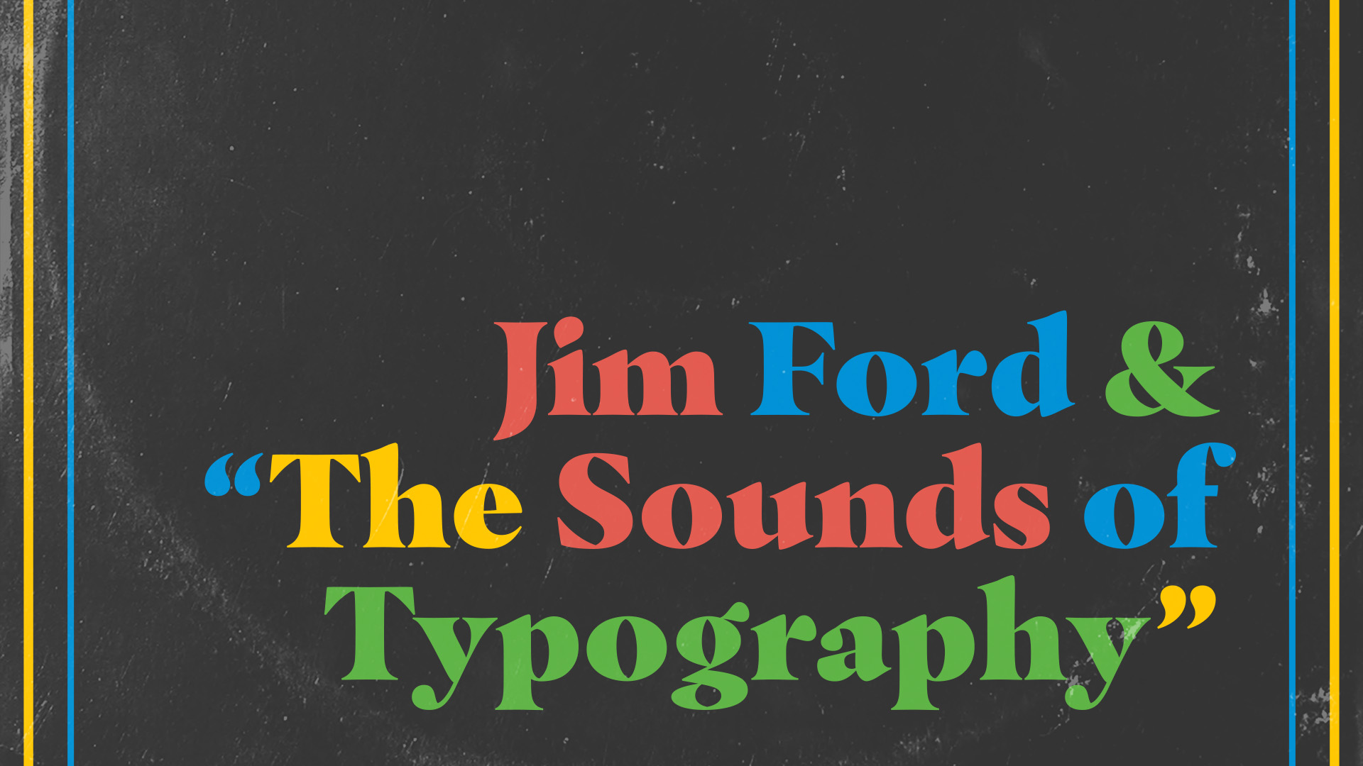
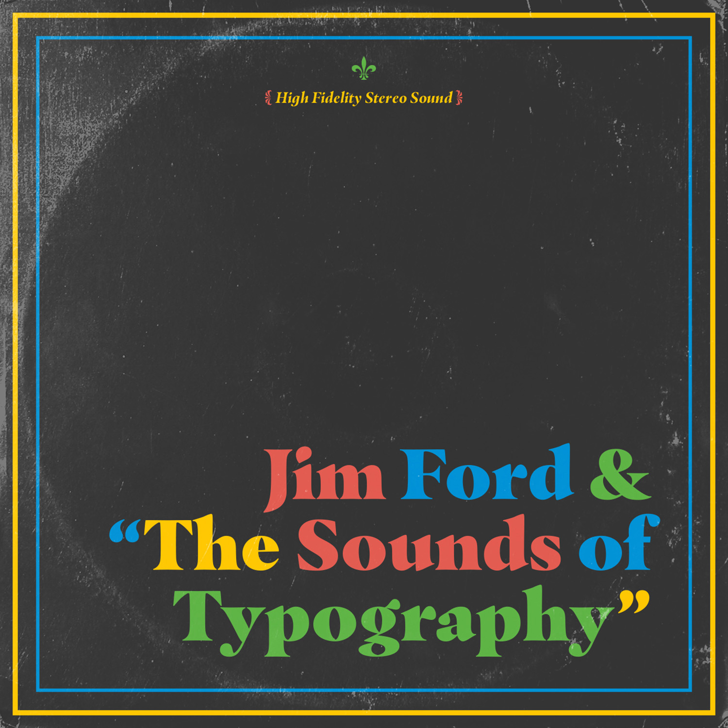
Jim Ford & “The Sounds of Typography”
How the jazz music of Miles Davis and driving in a blizzard inspired a new typeface
Published: 17 Mar 2017
Topics: Typography, Interviews, Writing
TL;DR: This expressive typeface attempts to channel the energy of jazz improvisation
Almost Anything Can Inspire a Typeface
When you spend time talking with designer Jim Ford, you quickly realize that his love of jazz is not just a quirky marketing angle, but rather a deep obsession that has inspired his newest typeface, Masqualero.
Jim Ford has been a huge Miles Davis fan since he started playing music in his 20s. “I read his autobiography and listened to his music. I know a lot about him and his career and wanted to do a tribute. I’m always looking for anything to inspire a typeface. I’m a believer that almost anything can inspire a typeface.”
Blizzards and Inspiration
The idea for Masqualero, started in a very unexpected way; while driving his car in a blizzard. “I was driving from Illinois to Wisconsin in the middle of winter and we had a blizzard with 14 inches of snow on the ground.”
Ford was listening to his favorite Miles Davis album Sorcerer and specifically to the third track Masqualero when inspiration struck.
“Jazz is winter music for me. In the winter, I prefer jazz because of the warmth of it. It does something for me.”
“While I was listening, I just decided to make a homage to Miles because I’ve taken some things that he has said and applied them in my own career and he has been very influential to me, so I wanted to honor him.”
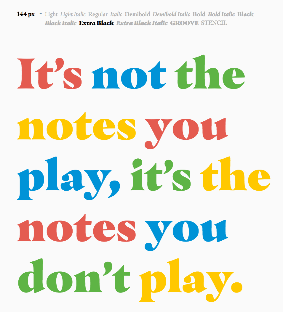
The idea was simple: Ford wanted to make a serif typeface that would be one part classical—touching on Davis’ roots and training as a musician—and one part innovation; which refers to Davis’ legendary experimental albums of the 1960s and ’70s.
“The typeface is supposed to be fierce like Miles; really sharp, but still elegant.”
“I maintain Masqualero was inspired by the song partly because I like the name, which is a made up word just like the word ‘jazz’. The typeface is directed at Miles.
It’s not just about the song, but also connected to his personality and background as a musician. He was such a hard-ass with people. Masqualero kind of needed to be that way. The typeface is supposed to be fierce like Miles; really sharp, but still elegant.”
This famous quote deeply affected Jim Ford while creating Masqualero. “The quote is abstract, but it applies to a lot of things. Without black, you can’t have white. You can draw a line between that and letter spacing.”
“It’s not the black that makes the shape, it is the white around the black that frames it.”
The same goes with music. “If a solo musician fills every second with a note with no space in between, it doesn’t work—you need the silences, you know? You need to shape it or else there is not any rhythm. You can hear that when you listen to Masqualero in Mile’s solo—the way he approaches playing.”
“He thinks of playing music like a boxer. He is jabbing and jabbing and jabbing and finally at the end, knocking them out.”
“You can hear it in the song, his phrases are spaced out, understated. It is where his horn punches through that it makes it so interesting. He is painting over the other colors played by the other musicians.”
The Design Process
“The process of making Masqualero was kind of like painting with music. The music is a creative tool even if the approach of art and design is different. I was letting the music be part of the drawing.
It is hard to describe the thought process, because type is such a detailed thing, you’re making some momentary decisions that don’t always have a quick explanation.” Ford laughs, “It feels right—or something like that!”

Ford started designing in the demi-bold weight. “It isn’t the showiest of the family, but it is the base. The extra black and the light weights were particularly challenging.” The stencil and groove styles came later as suggestions from Steve Matteson with help from Charles Nix.
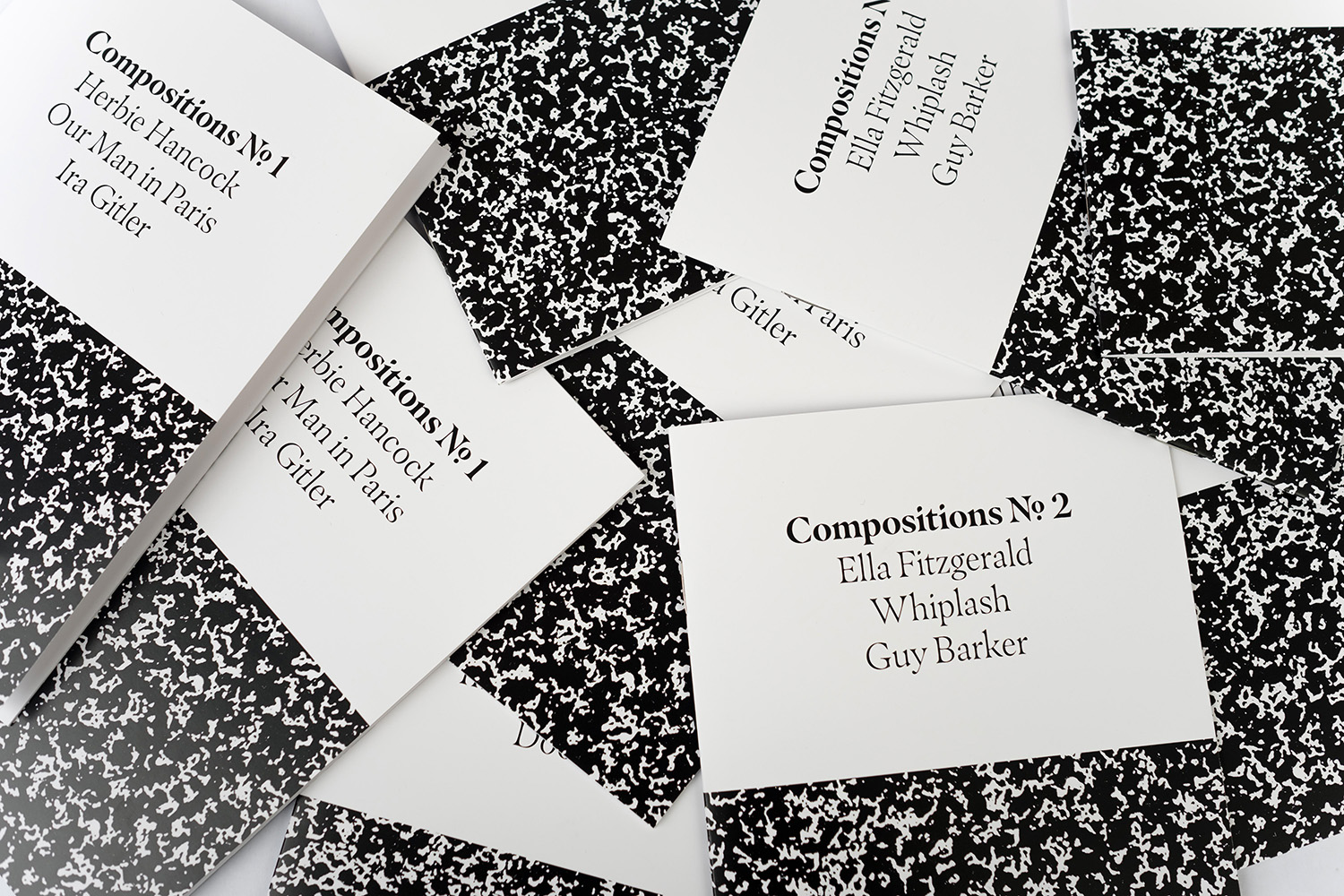
In creating Masqualero, Ford has created a typeface that expresses his passion for music, art, and communication that, luckily, is available to everyone.
Extended Play
Willing to be a bit more adventurous? Listen to a live version of Masqualero from 1970 where Miles Davis shows off the improvisation which made him a legend.
A version of this article appeared in a previous publication