Building a Typographic System
The fun and challenge of font pairing when you’re the client
Published: 30 Sep 2020
Topics: Faculty, Typography, Work
TL;DR: Surprise! We spent a long time thinking about fonts.
Building & Expanding the Brand
Recently, we launch a new website for Faculty. This is our second website for the company and I am extremely proud of the progression of the design, interaction, and display of our work.
Naturally, because I’m me, I want to specifically focus on building a typographic system for the new site and how we used it to evolve the Faculty brand and build for the future.
Typographic Pairing
Pairing typefaces has always been a fun challenge for me. Finding fonts that compliment and contrast each other, while working together isn’t easy, but I’ve found it to always be worth the effort.
With the old website, we already had a pair of typefaces that worked great: Mallory by Frere Jones and Pitch Sans by Klim Type Foundry.
We used Mallory for all of our body and display copy and Pitch Sans did the heavy lifting for all of the nerdy, technical information.
When we started redesigning the site, Henry and I knew we wanted typography to be more center-stage and quickly worked on trying to convince Chris that we should add a new typeface to the stack.
He wasn’t convinced at first ;-)
Exploration & Discovery
So we did a lot of exploration. We wanted something that would give a more life and energy to the Faculty brand. Mallory and Pitch Sans are great, but felt too sober on their own.
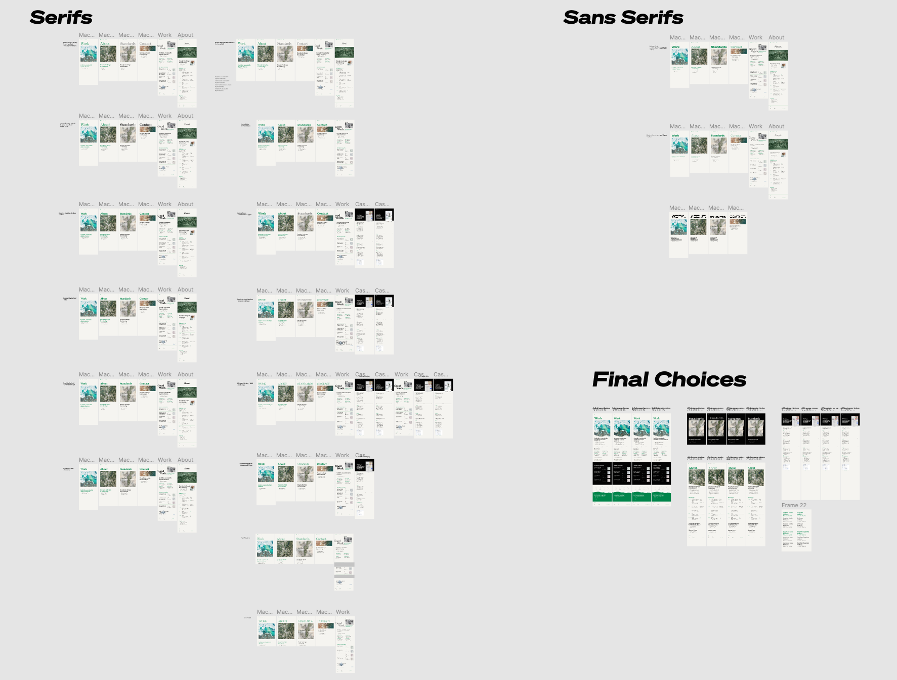
As you may have noticed, there is a big type trend right now using super-expressionistic/chonky typefaces (Chobani, MailChimp, Dropbox, et. al) to bring some life to brands, so we started by trying some of those.
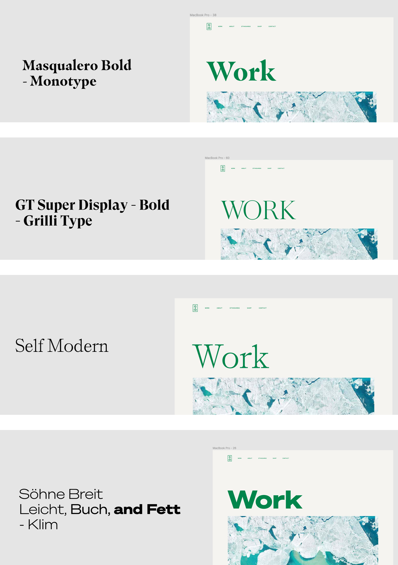
Shown here are Masqualero, GT Super, Self Modern, and Söhne. Although I personally love all of these for different reasons, they didn’t feel quite right for Faculty.
Our work at Faculty typically eschews the flashiest trends and focuses on good design and IA and we are quite proud of this—so we needed a typeface that would match our approach.
Finding the Right Balance
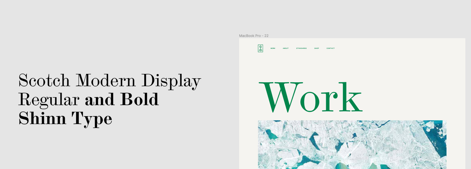
I first thought about Scotch Modern typefaces as they are personal favorites and aren’t used often on the web. They were nice, but perhaps a bit too stodgy and dated feeling.
This lead me to thinking about Clarendons and type specifically made for newspaper printing. There is a nice history of typefaces made for newspapers (ie: the “Legibility Group” by Linotype) and the connection with information and academic work fit nicely with Faculty’s ethos.
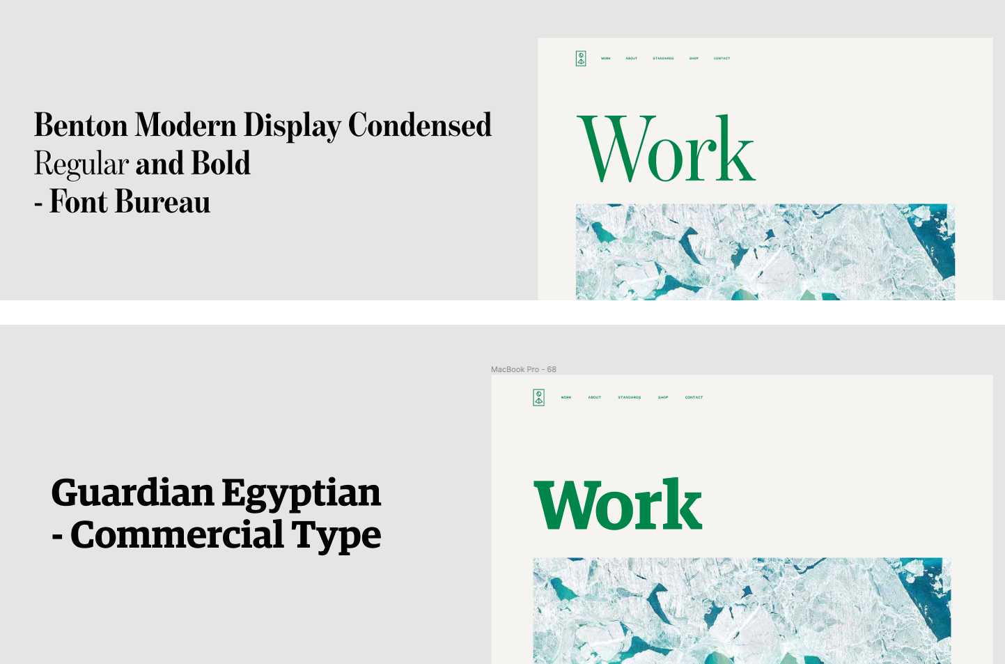
Finding the Right “Newspaper” Face
We tried Benton Modern Display Condensed, which was very pretty but almost too “Wall Street Journal-ish” and Guardian Egyptian which was too connected with The Guardian newspaper itself.
Both were a bit too on-the-nose.
Which eventually lead me to my favorite style of “newspaper” typefaces: Ionics.
According to Commercial Type:
“The bracketed serifs & ball terminals of the traditional Clarendon, also known as Ionic, first emerged in Britain in the middle of the 19th century … they have long been a common choice for newspapers … and are a natural choice for long texts.”
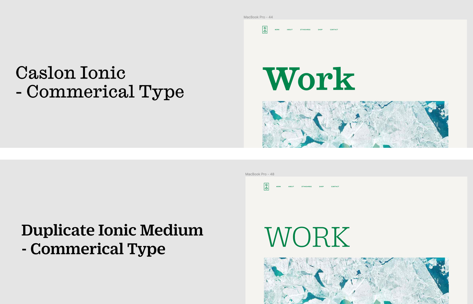
Finding the Right Ionic
Once I was focused on Ionics, it reminded me about how the Letterform Archive uses Duplicate Sans and Duplicate Ionic on their website in a really nice way.
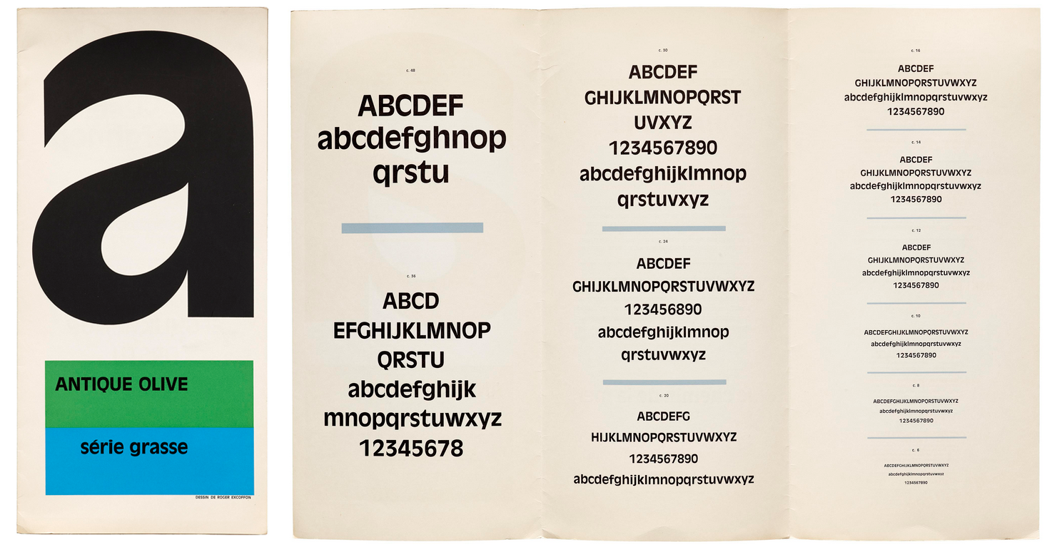
Duplicate is a personal interpretation by Christian Schwartz of Roger Excoffon’s 20th century classic Antique Olive from memory.
Duplicate Ionic is a fun conbination of an Ionic with the more modern Antique Olive. It feels rooted in history, but also fresh.
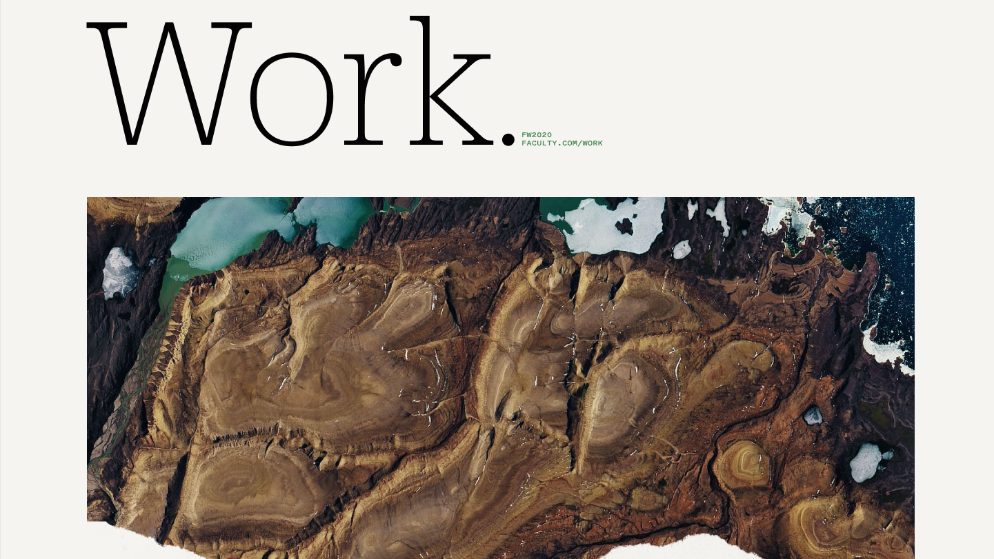
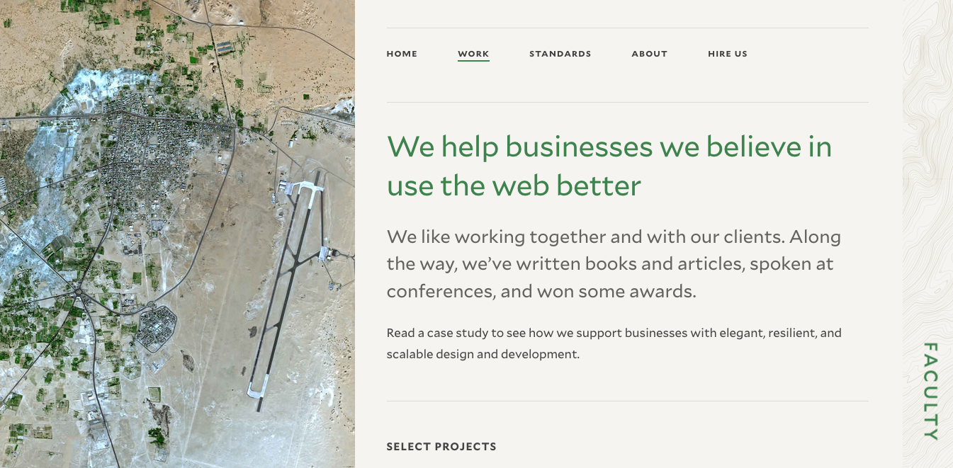
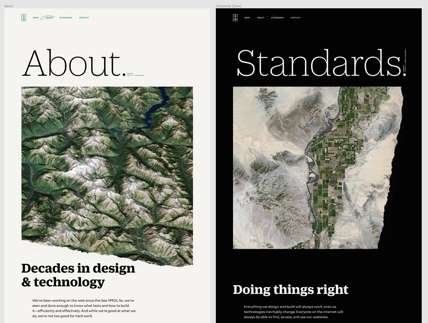
Using an Ionic a Bit Differently
For my last step, I wanted to take an Ionic, which is usually used in small sizes and for long copy, and try to use it for large sizes and display copy. So we decided to flip the typical script and use Duplicate Ionic for the headlines and Mallory for the body copy, with the ever-present Pitch Sans still perfectly displaying the metadata and informational elements.
And, if I can brag just a bit, I think it looks freaking great as a typographic system.
So that’s a little inside-baseball on how I approached building the Typographic System™ for Faculty. I hope you enjoyed reading about my thought process and will consider building one for your own projects in the future.