New Work: Delve Fonts
A ground-up redesign to help a type foundry grow
Published: 20 Jan 2020
Topics: Work, Technology, Faculty, Typography
TL;DR: We made a new website all about fonts!
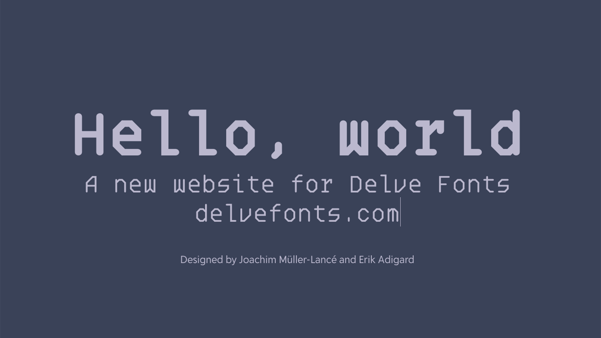
I’m beyond excited to announce our recent work for Delve Fonts.
We were asked to redesign and develop a new website from the ground up to show the new face (pun not intended, but now that I think about it…) of Delve Fonts to the world.
My role was art direction, client communication, and type nerdery, with design lead by Henry Desroches and help from the rest of the Faculty team to make it fast, reliable, and responsive.
The First Step in a New Direction
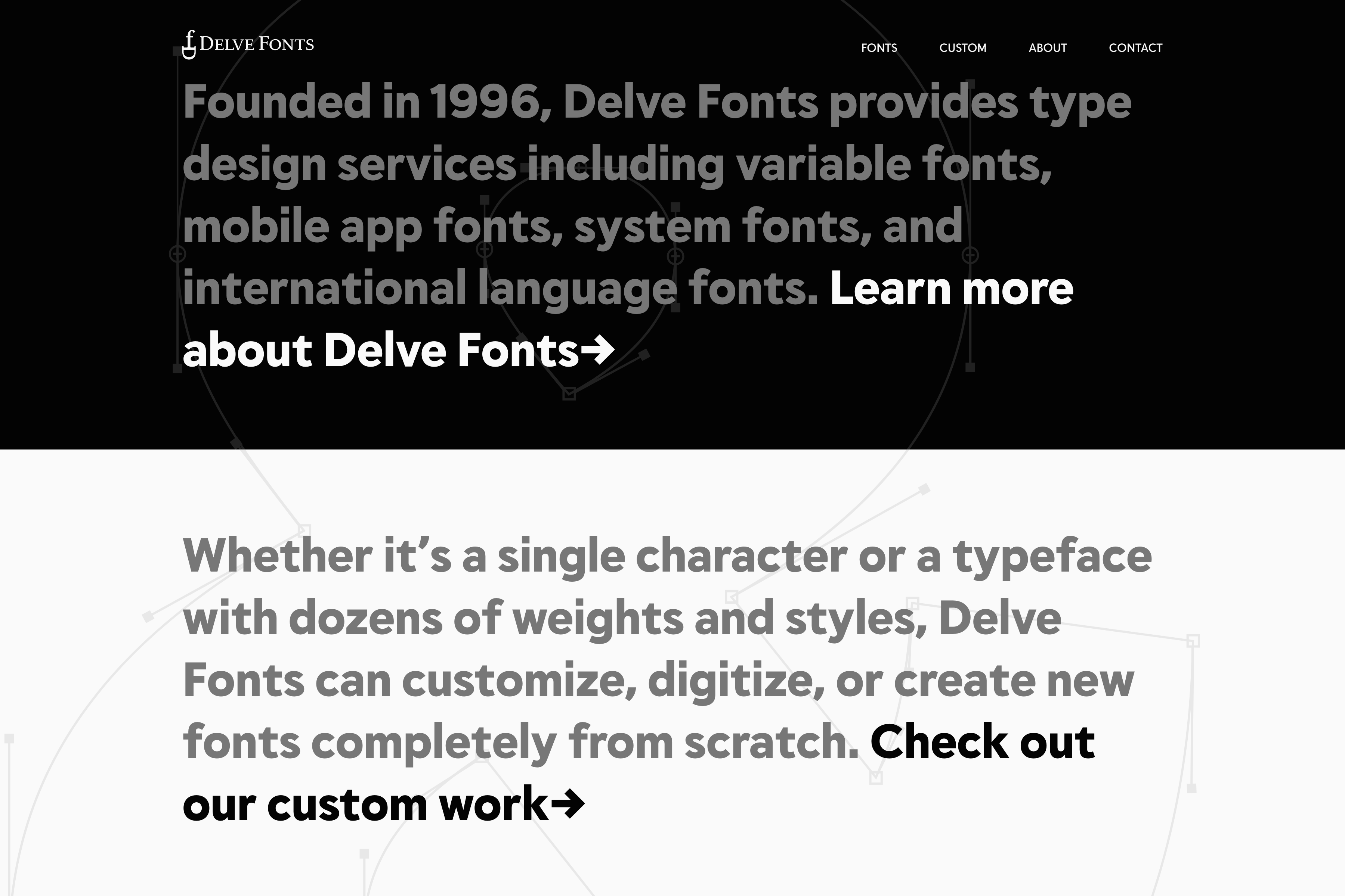
Our goal with this project was to update not only the website for Delve Fonts, but also the entire brand, typeface library, and interaction with their customers. Delve has big plans to expand the brand and this new website is the first step in a new direction.
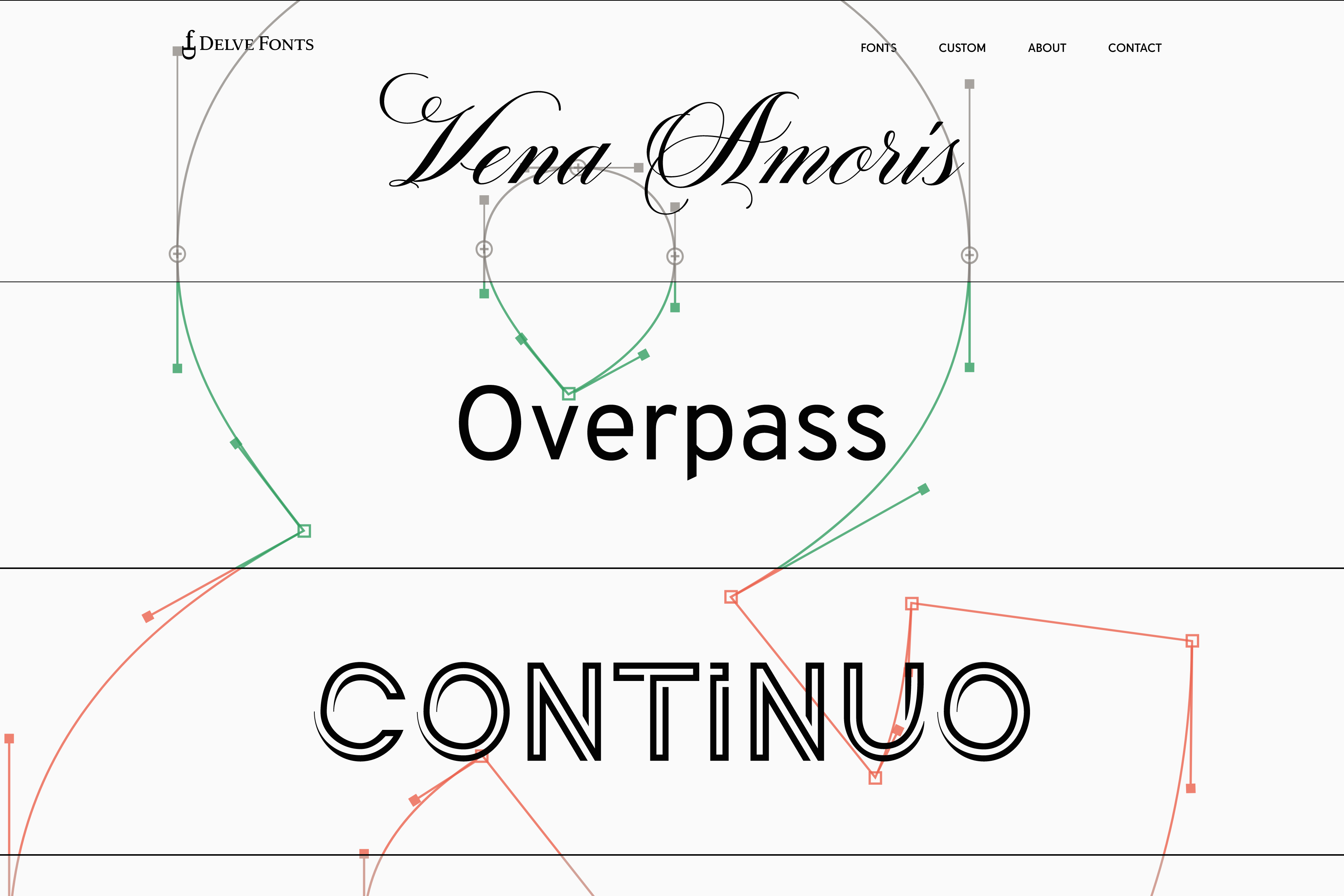
The previous website was hand-coded by Delve over a decade ago (nothing wrong with that!) and was beginning to show its age. Our focus was to make the typography front-and-center and let the type speak for itself. I know this sounds obvious, but it wasn’t easy.
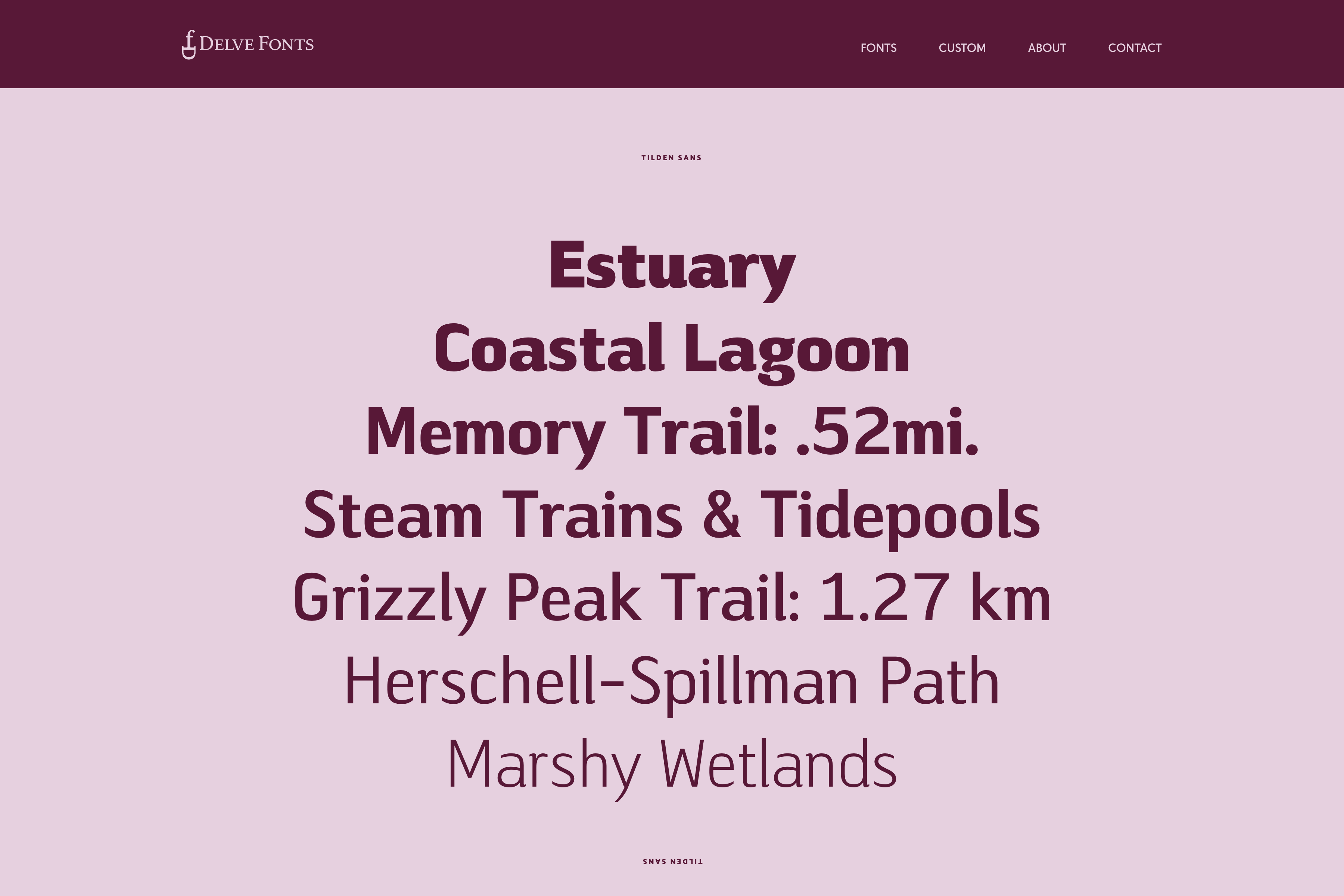
On the font pages, you’ll notice that a majority of the type is editable. Click almost anywhere and you can type any character that the typeface contains. Seeing real words, in the real font, as directly as possible was our driving force.
This was also a great opportunity to play with Delve’s first variable font, Tome Sans. If your browser supports it, Tome Sans Variable will load, which is a mere 92kB—instead of loading all 20 styles, which added up to over 970kB. 💥 The Future is Now! 💥
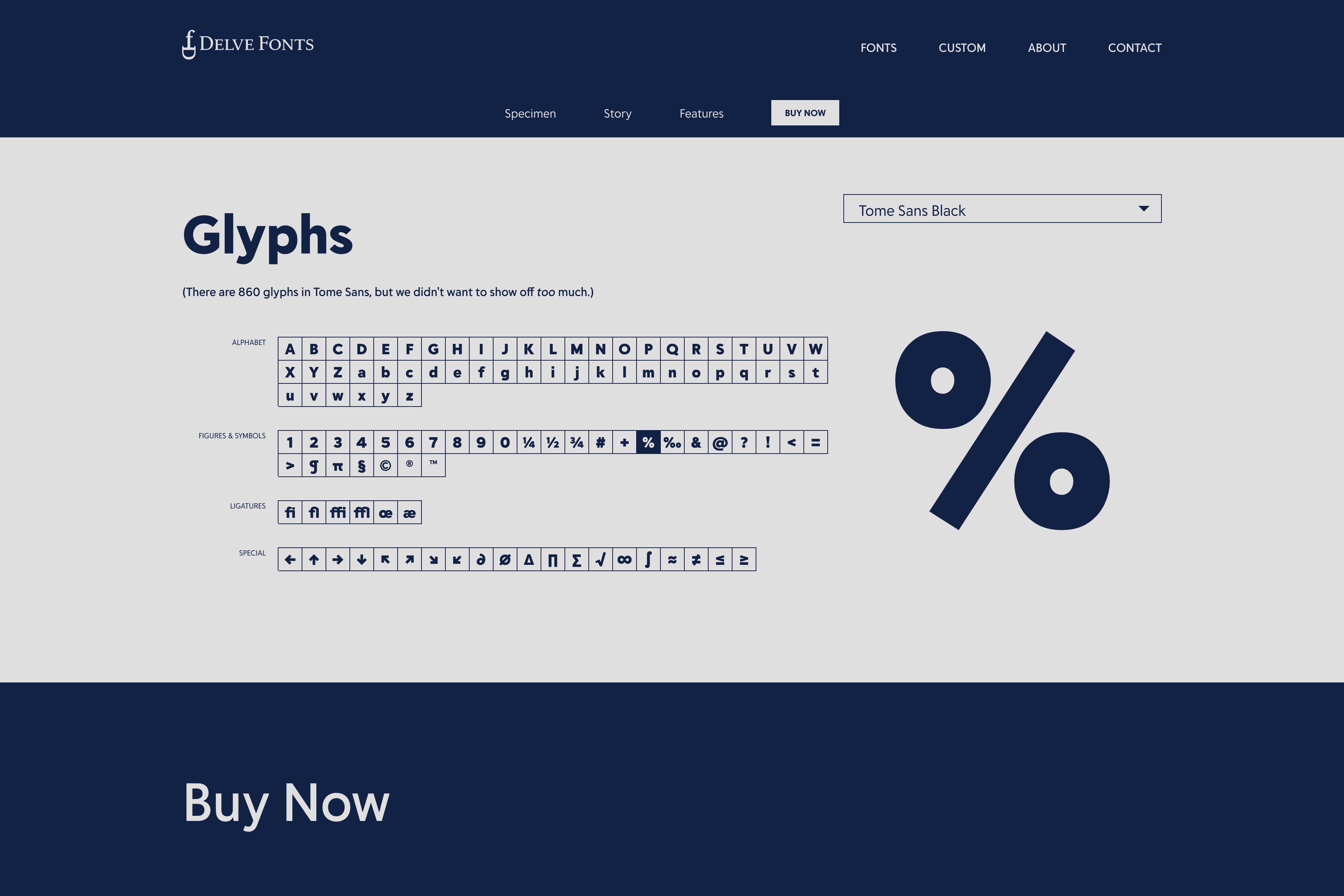
With the “Glyphs” section, we strived to strike a balance between showing every character in a typeface (sometimes 800+) and not overwhelming potential customers. Choose any weight or style of a typeface and you will see beautiful, large previews without covering the entire page.
Custom Design & Credit Where it’s Due
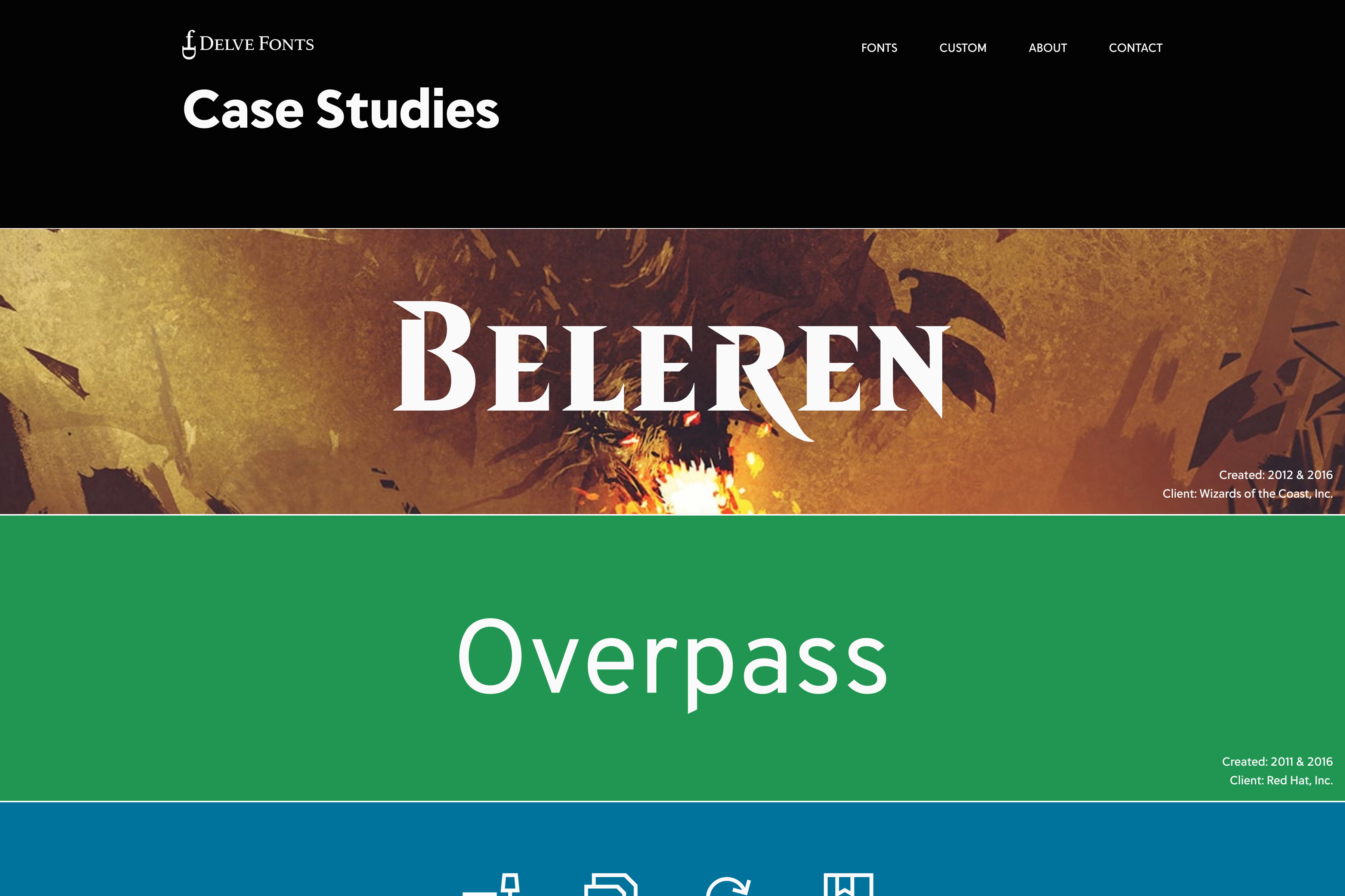
Another aspect of Delve Fonts is custom type design. Previously, this was somewhat hidden on the website and we wanted to place a spotlight on this work with new case studies.
Of personal note: Make sure to check out Overpass, which is wonderfully open source and free to download.
From the beginning, Delve wanted to make sure the designers that create type for him get credit for their hard work. Many people may not know that Delve Fonts is more than just Delve, but now with the designers page, all designers are showcased.
In Conclusion
I must say that Delve was an incredible client. He had a vision for what he wanted, but trusted us to surprise and challenge his ideas. We even suggested removing some fonts in the library, which may have been a step too far for some clients, but he had confidence we were working as a team and had his best interest in mind.
