Writing for Tobias Frere-Jones
Helping tell the stories of some very famous typefaces
Published: 16 Jun 2023
Topics: Typography, Interviews, Writing, History
TL;DR: I interviewed and wrote about Tobias Frere-Jones; one of the best type designers living today
Writing About Some of My Favorite Typefaces
This week, the first two in a series of eight articles have been published under my byline on the Frere-Jones website. These articles about Archer and Surveyor go into the history, details, and personality behind some of the most important, modern-day typefaces that Tobias Frere-Jones has designed.
In the summer of 2022, I was hired by Tobias to help tell the story of eight typefaces that were important to him and the larger design community. I’m fairly sure that Tobias would hate if I called him a “living legend” in the world of typography, so instead I will share a few of my observations on interviewing a designer that I’ve admired since starting my design career 20 years ago.
These articles represent eight days of virtual and in-person interviews with Tobias and additional months of going back-and-forth on drafts of the articles in order to get the details correct.
Full disclosure: The first typeface ever purchased with my own money was Gotham, back when I was starting my freelance design practice. So I wrote these articles as both an admirer of the work, and as a typographic historian doing my best to get the story right.
This is Not “That” Story
I know that many people will want to read the story of the split between Jonathan Hoefler and Tobias Frere-Jones in 2014. These articles are not that. Of course I write about the many typographic hits that Tobias created during his time at Hoefler & Frere-Jones, but I don’t go into the story of their break up. In fact, there were questions I asked Tobias that he declined to comment on.
To be honest, I’m not sure if the full story of their split will ever be told since the fonts are now owned by Monotype. Tobias finds himself two foundries—and in some cases, two decades—away from his work and it seems this distance has allowed perspective and fostered a desire to talk about his work.
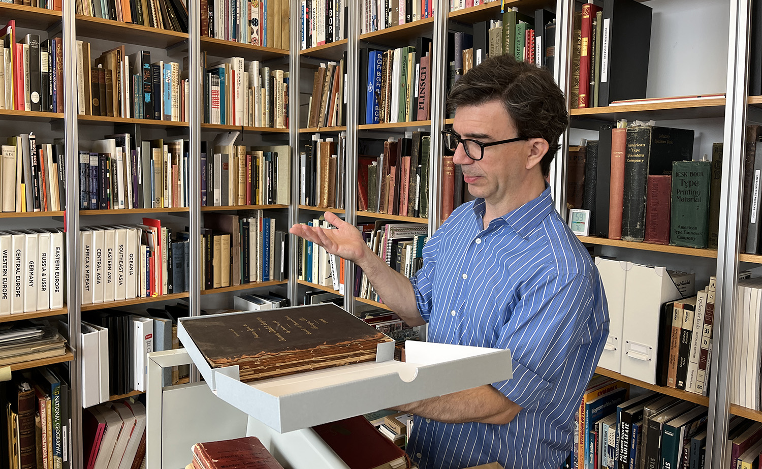
![Tobias leafing through two of his collected atlases; [closed at left] Black’s General Atlas of the World, 1888[open] Marks’ World Atlas; circa 1890](http://images.ctfassets.net/1s5n9k3u1r9d/5g5Jee3HIbSKMmeJquvuhv/266390c63dd06256335961fc8eef7f73/tfj-book4.jpg)
Getting It Right
As someone who cares deeply about typographic history, I want to be sure I’m giving the most objective and historically-accurate account I can since I am attaching my name on these articles, rather than ghost-writing them for Tobias. Through the interview and writing process, I spoke with several former H&FJ employees to do my due diligence and confirm the general accuracy of what I was being told.
I went about this process carefully, because I wanted to stay within my own contractual limitations, but I needed to be sure I wasn’t being told something dramatically inaccurate. So I asked these former employees to simply tell me their experience of working at the foundry and what they specifically worked on. I’m sure several of them wanted to ask me point-blank why I was asking these questions and for whom; so I appreciate their candidness and trust in my best intentions.
Keeping Things Objective & Honest
One final caveat: Just before this project started, Jonathan Hoefler launched his new personal website. This was around the time of Typographics 2022, so I didn’t have a chance for anything more than a passing glance at the site. Once I received the assignment for these articles, I made the deliberate choice to not read his site because I didn’t want these articles becoming a version of “he said, he said.”
These articles took trust on both sides. Tobias had to trust me to tell the stories of his work accurately, while still keeping an objective distance and I had to trust he wasn’t using me in a proxy war of words. So, I would ask that any readers look at my past work and dedication to the field of type history and understand that I write these as clearly and honestly as I can, without editorial influence from the outside.
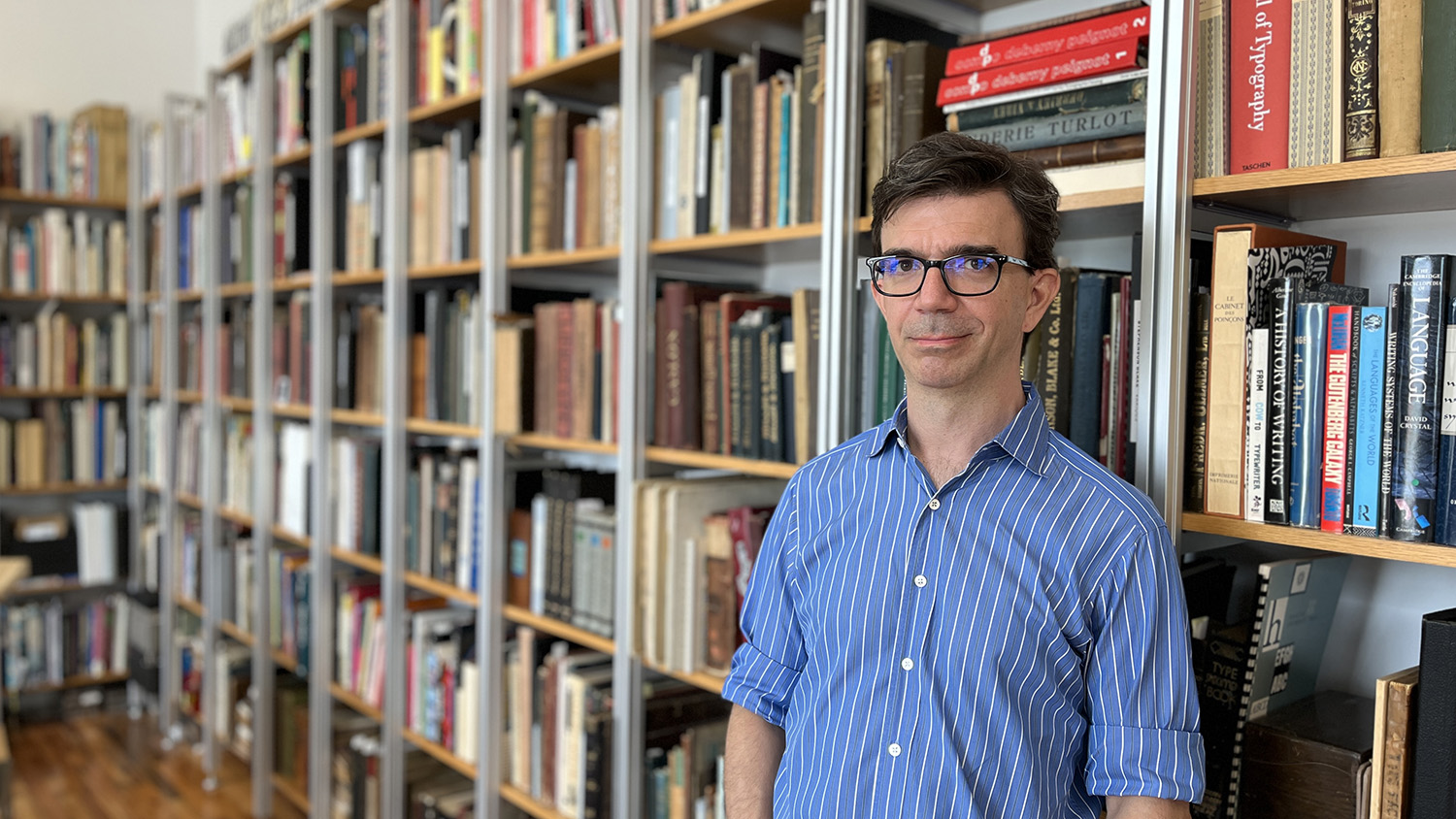
The Designer Behind the Faces
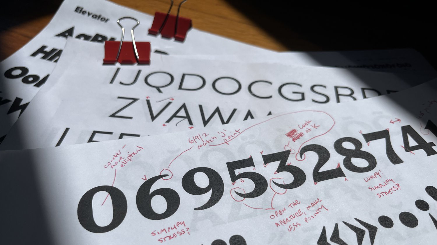
To listen to Tobias Frere-Jones talk about his work is to hear someone quietly confident and a little bit bemused by the impact of his type designs. He has been honored with the most prestigious awards in the industry, exhibitions of his work have toured internationally, and several of his typefaces are in the permanent collections of the most respected art museums in the world. Yet, when you speak with Tobias, you get the sense that he has simply followed his curiosity while attempting to solve a specific problem.
Tobias isn’t someone who crows loudly about his designs, but he is clearly quite proud of them. This pride is heavily weighted toward successfully serving the client, meeting a specific need, or scratching an original typographical itch. The projects he selected to talk about are the projects that meet one (or preferably three) of these criteria.
He also isn’t someone who insists that his work has changed the visual landscape (although I’m allowed to say it when considering Gotham), and he isn’t someone who declares his personal typographic philosophy. In fact, when I directly ask about his “personal typographic philosophy,” he struggles to articulate it clearly because he doesn’t appear to spend too much time thinking about it.
In my opinion, the simple phrases: Do the work; Solve a problem; Make something useful; clearly permeate his work.
Experimenting with a Purpose
Before interviewing Tobias, I had the incorrect impression that he was a “very serious type designer” who only made “very serious typefaces” which focused on workhorse designs like Interstate, Gotham, or Whitney. But of course not, Doug! Tobias went to school at RISD in the early-to-mid 1990s and obsessed over the work of Neville Brody, later working with him.
Naturally, many of his earliest typefaces—including the first typeface published by an established foundry (Dolores, FontShop, 1991)—were experiments in the extremes of ’90s grunge design. But like all things with Tobias, this experimental work had a purpose: an investigation in legibility, mixing of styles, and pushing boundaries in new directions.
Typographic Collecting from an Early Age
Tobias Frere-Jones states he “… came in through the window, instead of through the front door” of the type industry. With his father working as a copywriter on Madison Avenue and his mother as a print production broker, having art supplies and print mechanicals laying around the house was part of his childhood. When his dad learned someone was leaving the ad agency, they would sneak into the non-occupied office and grab handfuls of high-end colored markers, pens, and tracing paper to take home.
As a child, Tobias collected National Geographic magazines not only for the exotic photography, but as much for the typefaces that were used in the charts and maps. More than most children, he noticed the type and lettering around him in his native New York City. From subway train signage to parking lot ticket stubs, Tobias was collecting—both physically and mentally—a vast memory of typographic tradition and styles.
Re-occurring Themes
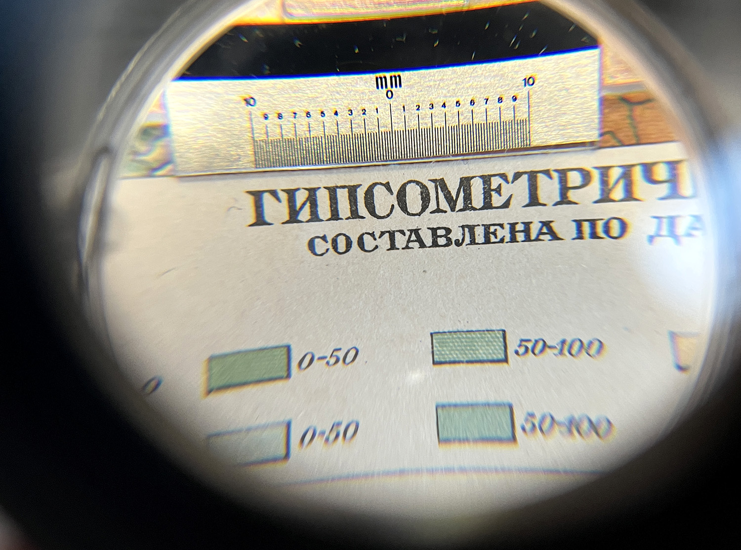
If there is a recurring theme to be found in Tobias Frere-Jones’ work, it is his unique ability to take “industrial” and “found” letterforms and turn them into compelling and successful typefaces. From Garage Gothic (based on parking garage tickets), to Interstate (based on the Highway Administration guidelines), to Surveyor (based on map engraving), to Gotham (based on signs and lettering in New York City), Tobias has a particular skill for interpreting found letterforms that were not drawn by professionals and professionally drawing successful typefaces from them.
But Tobias isn’t interested in having a specific “style” in his work—if anything, he is appalled by the idea. As he said when discussing Surveyor,
“If there is an identifiable visual style, that suggests I haven’t been moving around enough to different kinds of ideas. I would hope there is a style to the kind of thinking behind them, the non visual part of it—I hope that’s identifiable.”
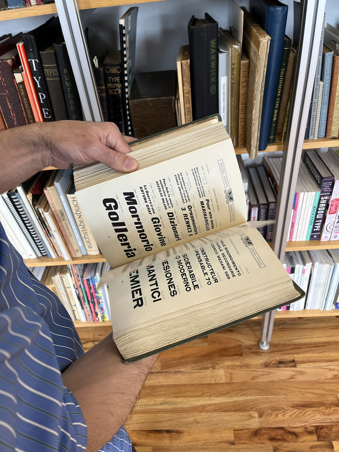
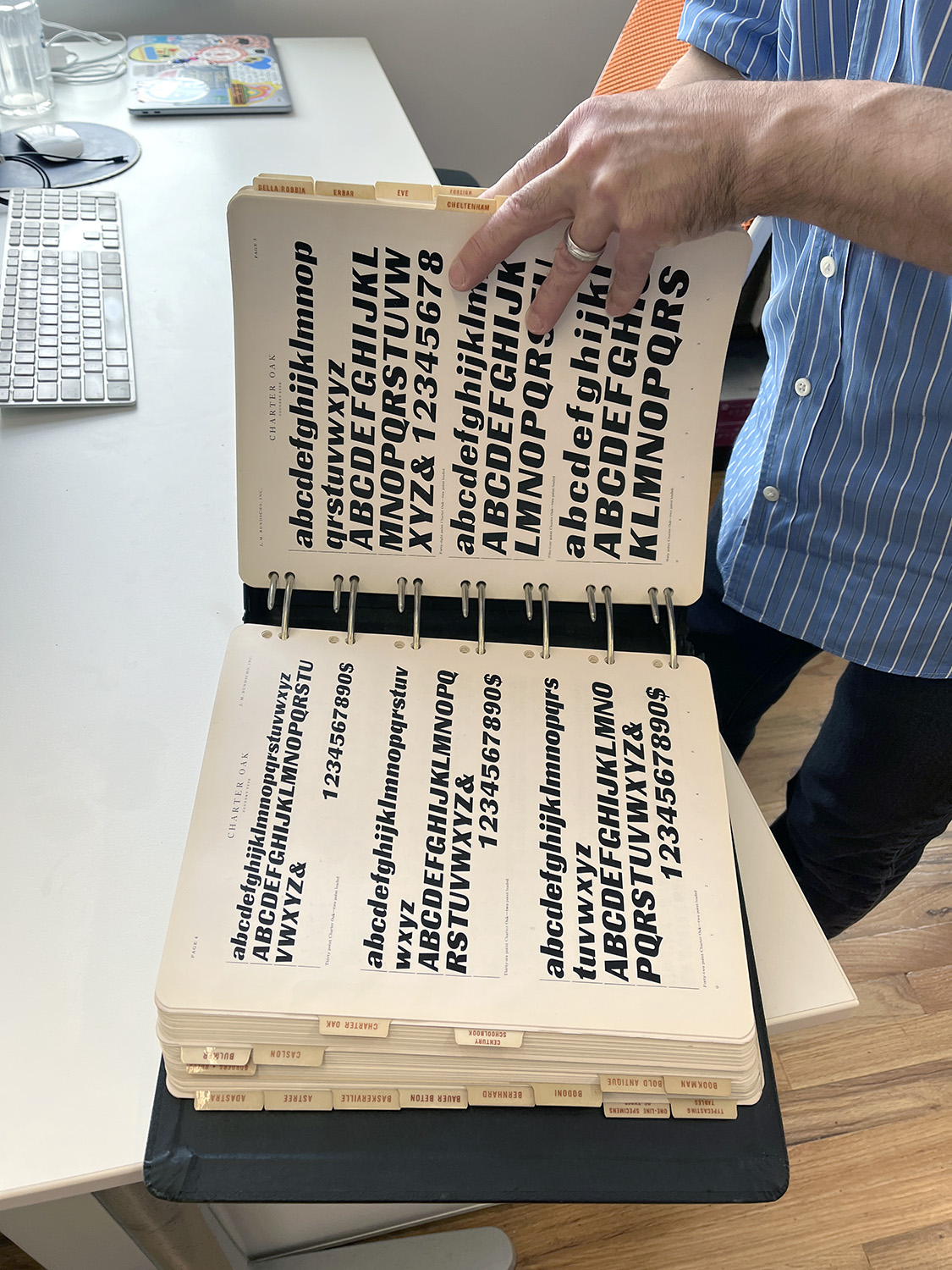
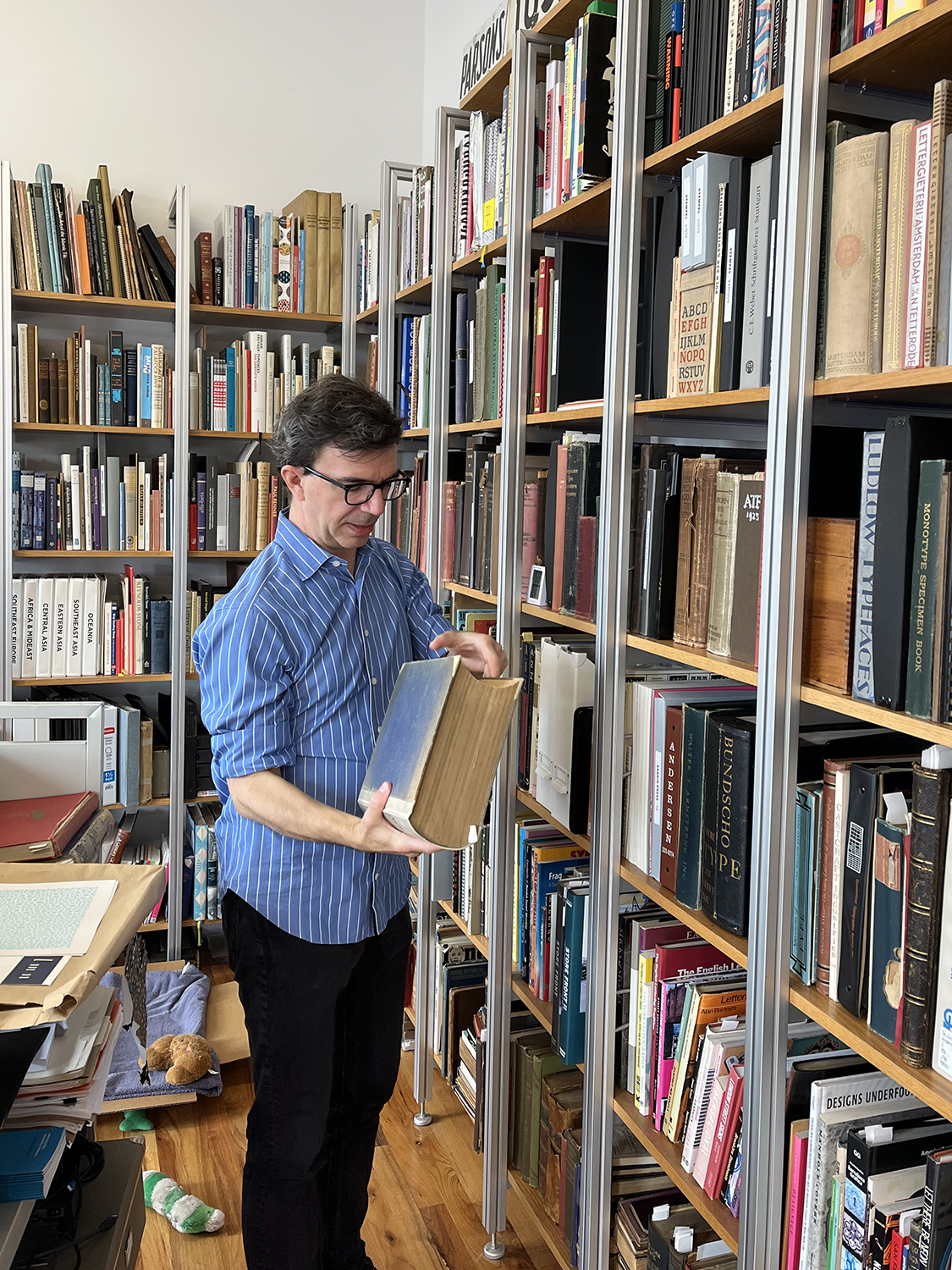
A Reference Library to Rival All
Today, Tobias’ typographic library resides in his studio in Gowanus, Brooklyn and is as impressive as it is vast. Along with books spanning multiple centuries of type history, there are a large number of vintage enamel signs and other three-dimensional objects. To say I’m jealous of his type library and collection is the largest form of understatement that can be contrived, but that is an article for another day ;-)
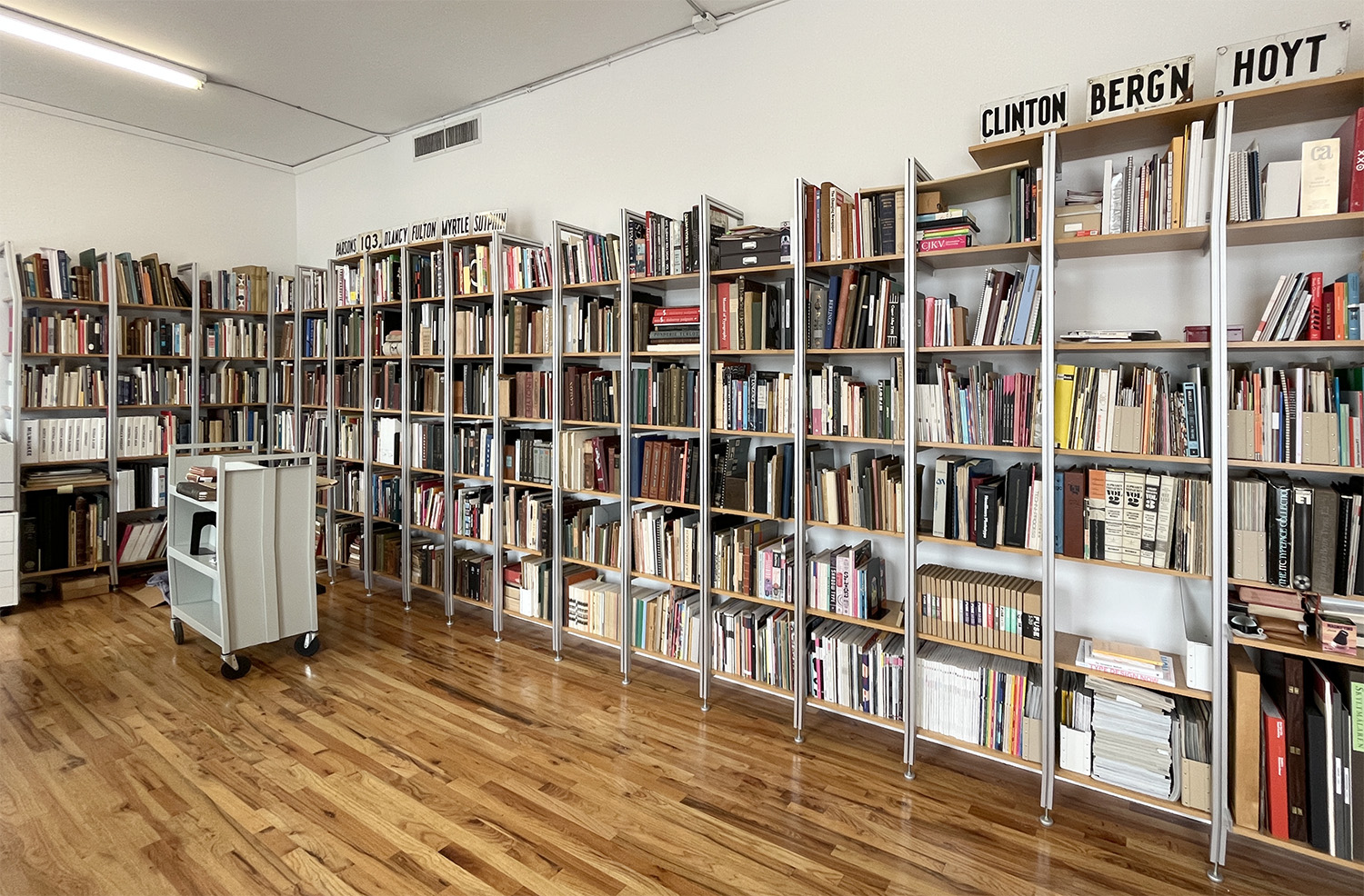
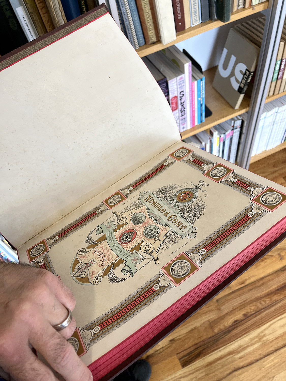
His collection acts as both reference and inspiration as his small design team work on projects. What strikes me most is Tobias’ memory of his specimens—it doesn’t seem he actually needs to reference his books except to confirm what he already remembers. For example, when taking about the related typefaces that impacted the design of Tungsten, he immediately locates the various specimen booklets from Nebiolo, Typefoundry Amsterdam, Ludwig & Mayer, and Letraset to show me what aspects he used as inspiration.
Alchemy and Alphabets
Recently, I was speaking with fellow Denverite and type nerd Kyle Read and the subject of Tobias organically came up. As is often the case when discussing type designers, it was useful to get another designer’s perspective. Kyle made an observation that I feel succinctly sums up Tobias’ particular skills:
“Tobias is an alchemist rather than just a chemist. Many other type designers can combine two different ingredients and see what reaction happens; but Tobias creates something entirely new and interesting.
Instead of adding one plus one and equaling two, he gets something entirely unique and different which somehow equals five.”
More to Come
There will eventually be eight articles published on the Frere-Jones website. Follow me on Mastodon or LinkedIn to see when the next articles launch. I hope you enjoy reading and learning about the typefaces and designer behind them as much as I did.
And if you have similar needs for you or your company, that’s what I do: write and research about type and letterforms, so please reach out.