The ABCs of XYZ
Writing about typography and working with good people
Published: 8 Aug 2022
Topics: Work, Writing, Typography
TL;DR: I helped my friends at XYZ Type launch their new website and wrote some words too.
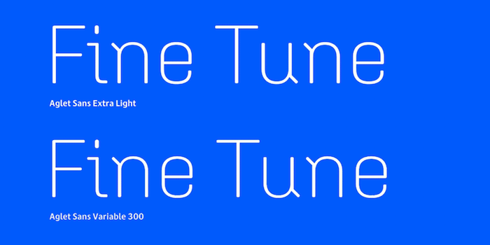
Recently, I teamed up with the talented type designers and overall great people, Jesse Ragan and Ben Kiel of XYZ Type, to help them launch their new website.
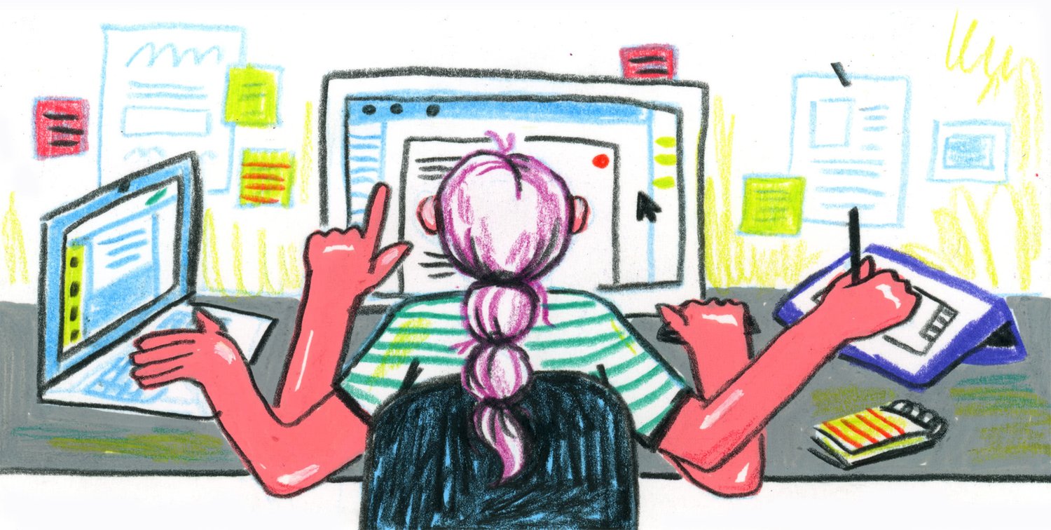
My main role was copywriting for the website; which included custom case studies, evergreen articles, and helping make the EULAs a bit more human-readable. Additionally, I used my project management skills to help push the website over the finish line and get it ready to launch.
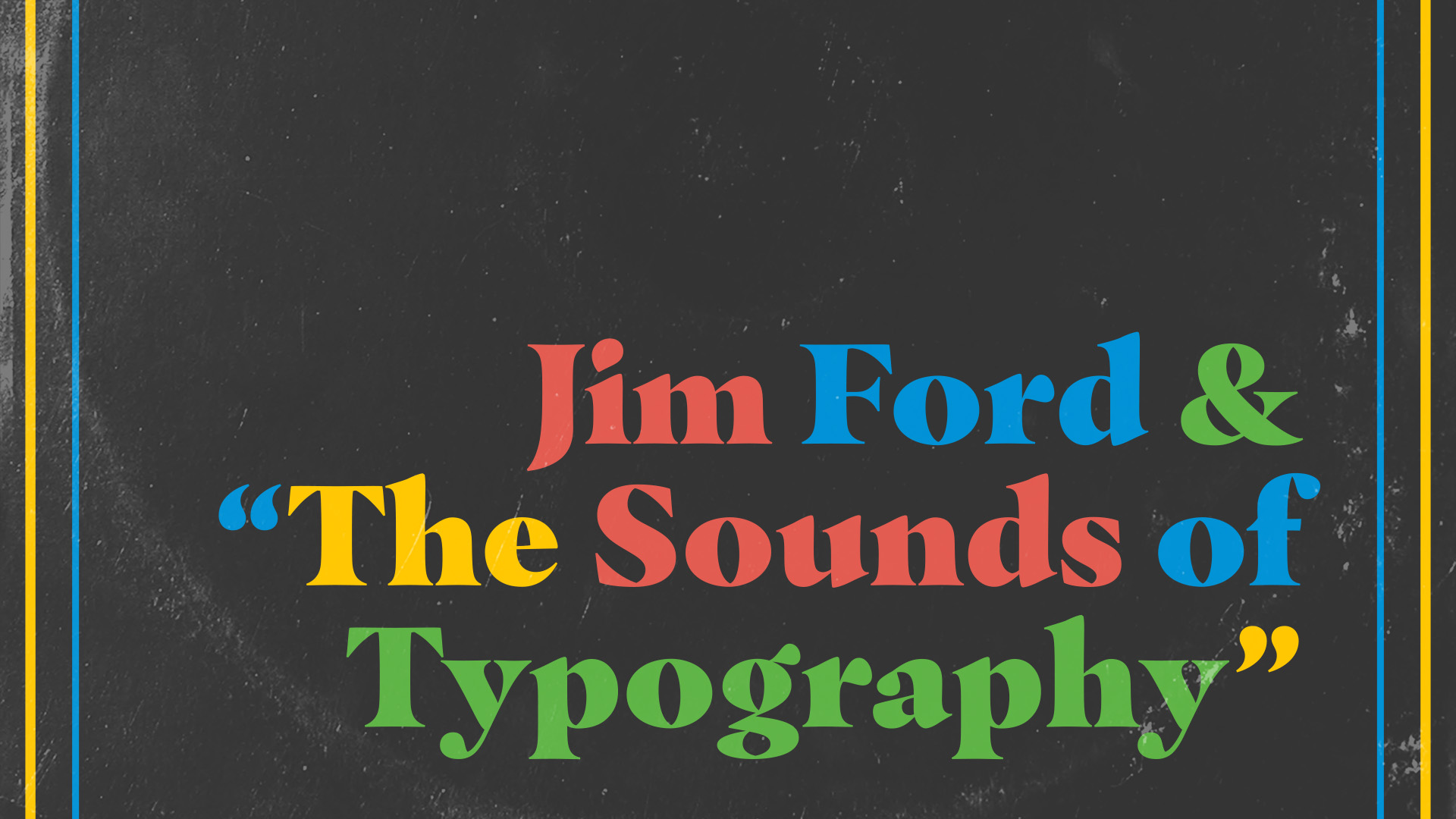
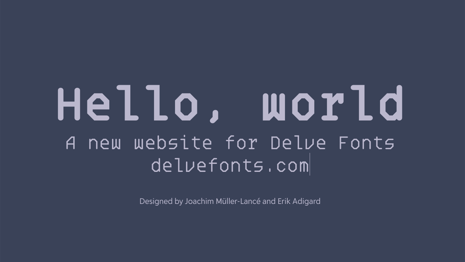
After a ton of hard work from a whole team of designers and developers, the new site has launched: xyztype.com
Custom Case Studies
The previous website had a page with XYZ’s custom lettering and type design work, but it was fairly thin — mainly linking out to case studies written by the design agencies they worked with. This was a fine temporary solution, but meant that the full stories of the custom work (and the fun type nerdery that goes along with it) was often missing.
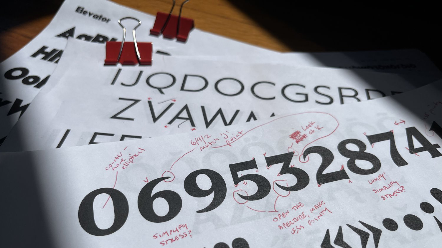
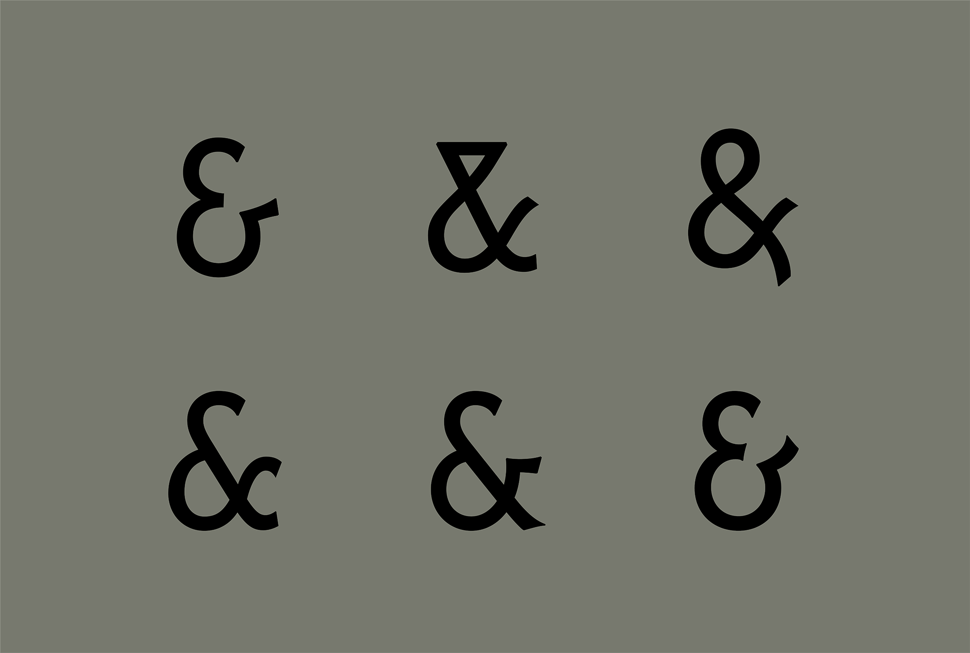
By writing new custom case studies, I was able to dive into the nitty-gritty details and tell the story of the work from XYZ’s point of view. Interviewing Jesse and Ben was my favorite part of this project; as I got to see the level of skill and obsession they put into their craft.
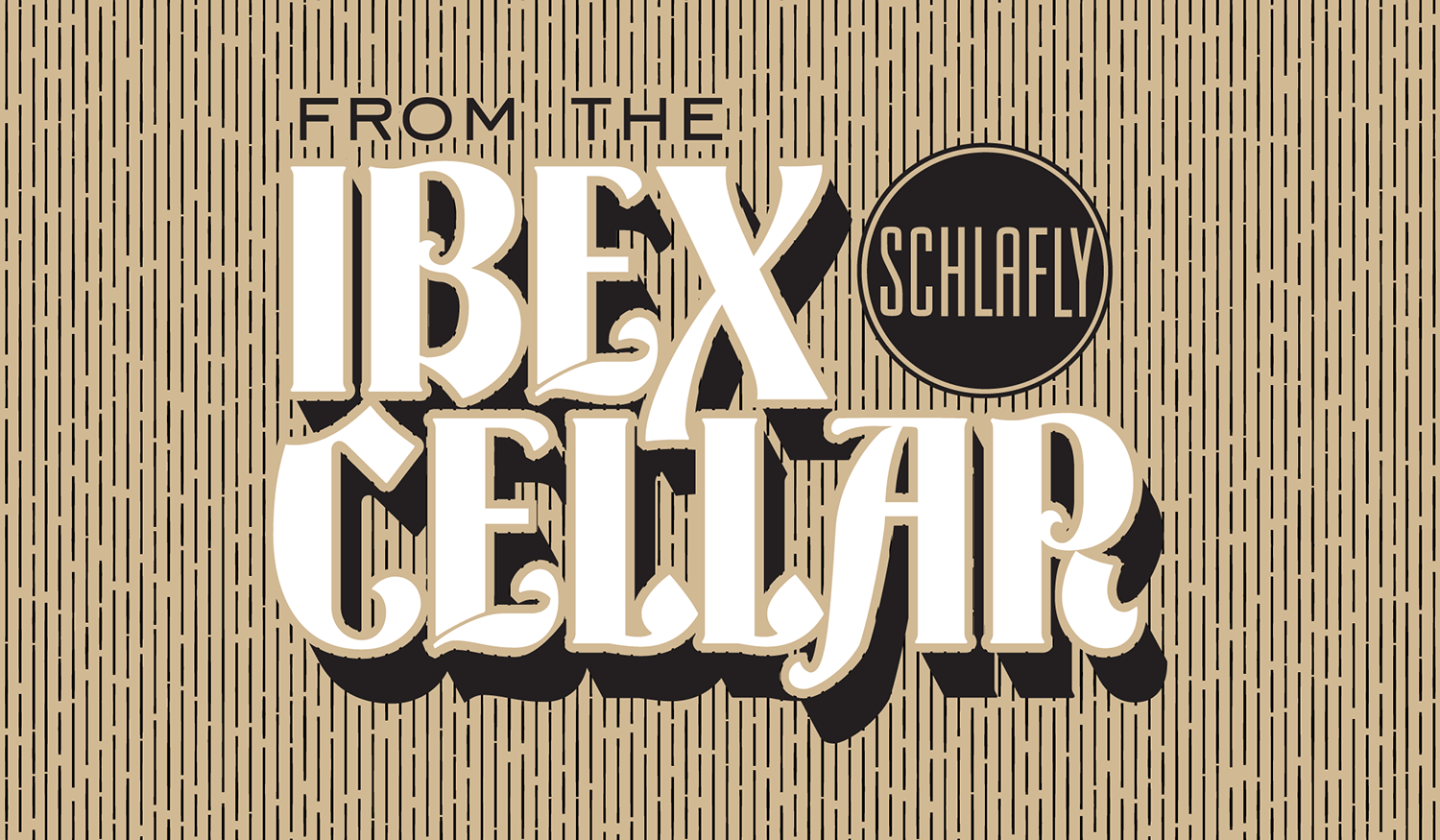
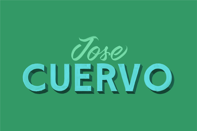
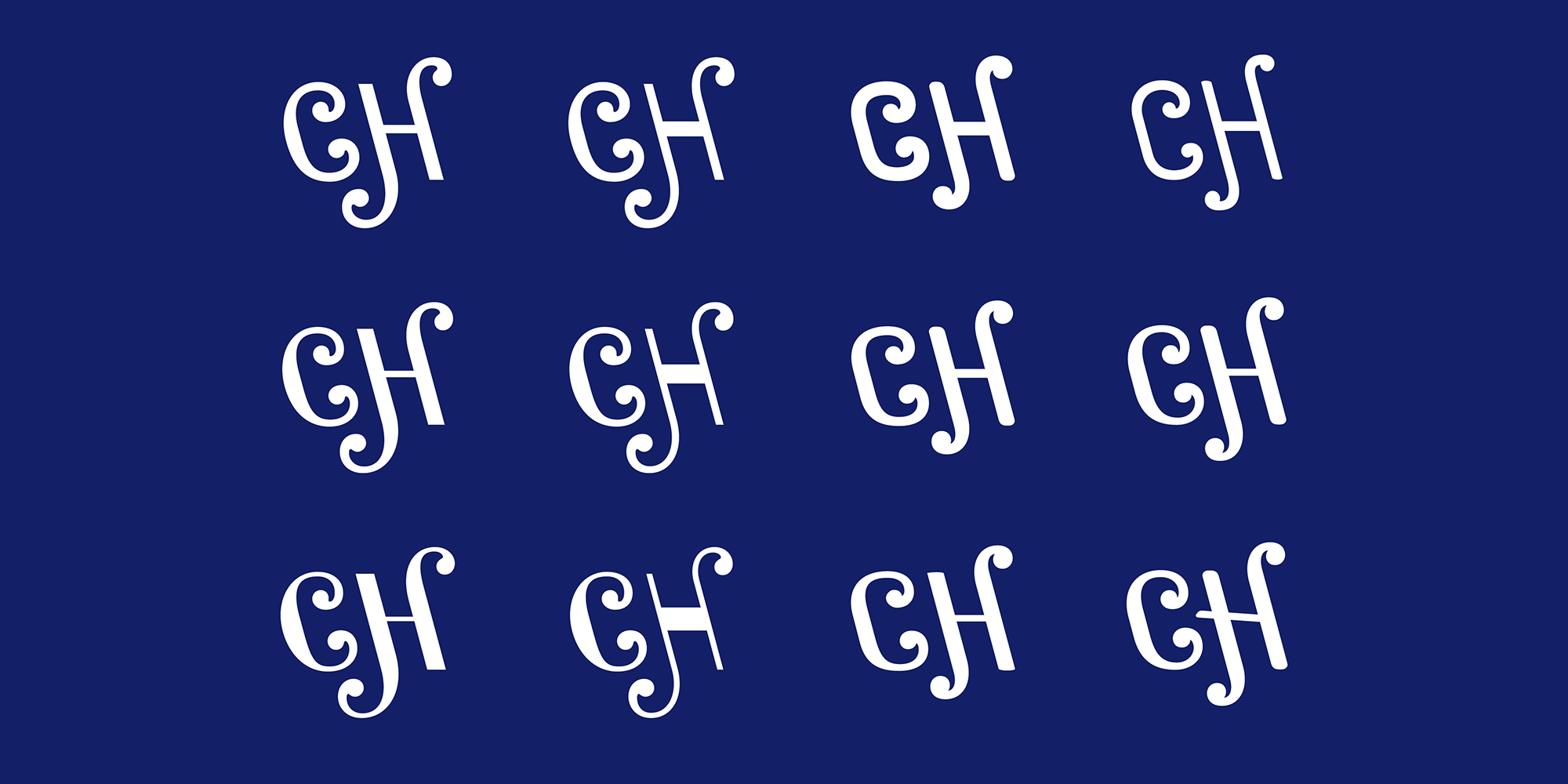
Learning about how Jesse matched the Casey’s word mark with the tail of the rooster or how Ben took multilayered PSD files from a sign painter and turned them into real working fonts was a fascinating glimpse into their process and amazing talent as type designers.
Trial Licensing Experiment
One of the interesting aspects of the website launch is XYZ’s new approach to trail fonts: free or paid trials.
Free trail fonts with limited character sets are nothing new — many foundries have done that for a while now — but XYZ created the idea of paid trial fonts. Paid trial fonts are the full retail fonts delivered for a flat fee of $20 per family which allows for real-life testing and presentation to clients.
This new model came from a good understanding of their clients: graphic and web designers who are designing a layout, website, or app and then handing off the files to the client or developers. These designers need full fonts to make sure they are exactly right for the project, but aren’t yet ready to purchase the full license (or need the client to purchase the correct license once the project is ready for handoff).
Will this new model work out for both designers and XYZ? Only time will tell. Of course, there is the possibility that sketchy designers will see this as an opportunity to get full retail fonts at a massive discount (if they are willing to break the EULA agreement), but XYZ believes that most designers are honest and simply need the easiest way to test out fonts for their projects.
At $20, this is an easy way to legitimize trying out fonts with the least amount of friction and without forcing designers to illegally pirate fonts. I’m excited to see how this experiment works out and I hope to see other foundries following in the footsteps of XYZ.
Project Management
Along with the copywriting, I was given the duty of helping push the website over the finish line. From organizing images that went into the final case studies, to doing in-depth site QA, to finding bugs with the cart system and font delivery; it was a challenge of staying organized and making sure every detail was covered.

This project management is something learned during my time at Faculty and has helped me as I deeply understand both the design and development process of taking a website from idea to launch. The amount of small details that make a final product of the highest quality is always equally surprising and satisfying.
EULAs: TL;DR
The last aspect of the new website that I want to point out is how we decided to address the bane of every type foundry’s life: End User License Agreements.
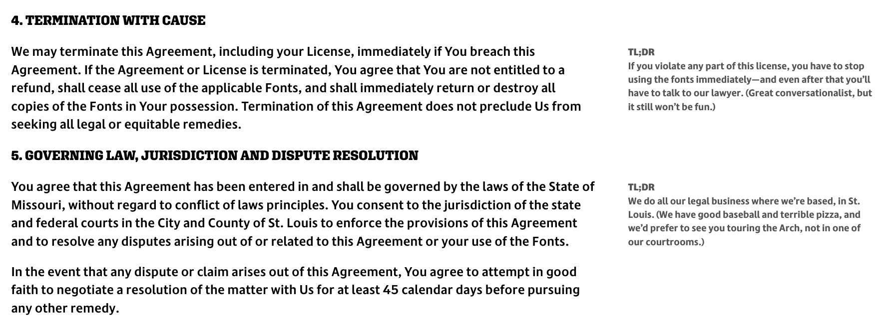
EULAs are a necessary part of licensing fonts, but I’ve never met a type designer that loved dealing with them nor have I met a designer that actually reads them. So Jesse and Ben had the idea of trying to make their EULAs more friendly and human-readable, without compromising the legal wording that needed to be included.
It was my task to take the EULA “legalese” and turn it into a series of TL;DR sidebars that explain certain paragraphs and sub sections of the various licenses. Although it was an arduous process, it was actually fun to take the dry-as-dust legal wording and simplify it down. Constantly asking Ben, “What does this paragraph actually mean in real terms?” helped all of us understand the licenses better and will make the EULAs less intimidating.
Need Help with Words About Fonts?
This project is a continuation of my experience working with type foundries, type designers, and publications for the past 11 years. I’ve found that being knowledgeable about type — but not being a type designer myself — allows me to get into the weeds without designers needing to explain basic typographic terms or concepts.
If you need help writing about your fonts, updating or launching your website, or getting an outside perspective on an in-progress typeface, don’t hesitate to reach out.