Writing Words About Letters
No way around it; writing about fonts is a challenge, but still fun!
Published: 17 Jun 2024
Topics: Writing, Typography, Work
TL;DR: Writing about fonts is not easy, but here are my thoughts and advice
Writing Words About Letters
Over the past 15 years, I’ve had the pleasure (and challenge) of helping some of the best type foundries in the world market and sell their fonts. Heck, I’ve even blogged about it several times on this very site.
I wouldn’t call myself an expert in writing about type, but I have a fair amount of experience working with many foundries, conferences, educational websites, and even a failed magazine about type.
So I wanted to share some insights that I’ve gained over the years. As always, these are my thoughts and your mileage may vary — what works for me may or may not work for you, and that is totally fine.

Words About Fonts
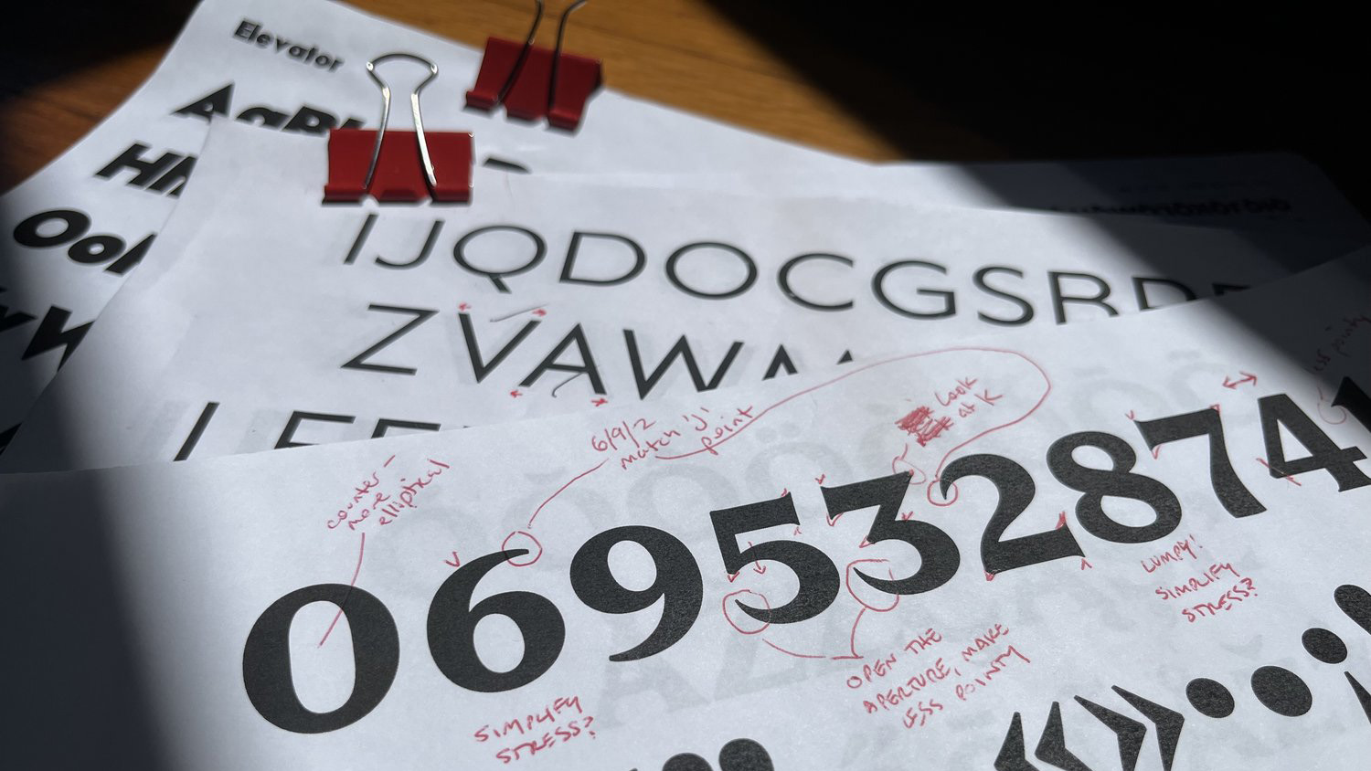
There is no easy way around it; writing about fonts is a challenge. Even with years of experience, I’ve lost track of how many times I’ve used thesaurus.com trying to find an alternative to the word “unique” while describing a new typeface or specific glyph. Explaining the visual aspects of a non-tangible product is hard and figuring out how to differentiate your typeface from thousands of others takes dedicated time and effort.

Finding the Forest for the Trees
I understand after spending months (years! decades!) on a typeface design, writing marketing copy about your fonts can feel like “hitting the wall” in the last mile of a marathon. It can feel daunting and nearly pointless attempting to describe all your work in a few short paragraphs.
To frame it a little differently, I suggest thinking about marketing as part of the design process. Writing effective copy and creating good imagery for your release are the crucial, final steps in finishing a successful typeface.
Spend your time considering why you made the typeface in the first place. What angle or new idea are you trying to work out? What problem are you trying to solve? Who would benefit from your new typeface? Where did your inspiration come from? What compelling story can you tell to make your work stand out?
Once you can think from a macro — instead of micro — view of your typeface, you’ll be able to better write about your typeface and create a compelling story to sell your work.

Know Your Customer
Too often, I see type foundries writing about their fonts for other type designers instead of their real audience of graphic designers, web developers, and advertising agencies.
To be blunt: Other type designers are not your audience!
As proud as you are of your kerning tables or specific Bézier curves, the typical customer really cannot connect with your typeface at that level and those details may not be of interest to them.
So much of type marketing is showing the possibilities of your fonts rather than the glyphs. Make sure you show potential customers how their work will be improved with your fonts. More specifically, elaborate on how your fonts will make their work look more professional, impress their bosses, or help elevate the customer’s user experience of a UI.

Find Your Hook & Keep Editing
Finding your “hook” or single thing that makes your typeface unique (see, I’m using that word again) is important when framing how you talk about your work. Maybe your typeface is variable and has a compact file size useful to web developers? Maybe your typeface is really good at tiny point sizes for captions and legal details? Maybe your typeface is specifically designed for long-form text reading on mobile phones?
Whatever sets your typeface apart is what you should spend your time writing about.
Once you have your hook, spend far more time than you think refining the copy. From my experience, writing is as much (or even more) about editing what I’ve written than something that comes out the first time as some sort of Genius Stream of Consciousness from a Talented Writer™ so don’t feel bad if you go through draft after draft of text.
If it makes you feel better, there was a project where I went through 10 drafts (!) before I got to a final version of copy that the client and I were happy with. It was a struggle, but it was worth it — much like designing typefaces, I’m told.

The Same Amount of Love
Don’t worry if writing about your work feels awkward — that’s ok. Every time I start writing about my own work or typography for a foundry, I feel the sinking feeling of “this is dumb,” “this is repetitive,” “this makes no sense,” and only by pushing through these feelings do I come up with content of which I can be proud.
Finding out that people as talented as Ira Glass feel this way helped me recognize this is a normal part of the process. So, do not despair when you start thinking about marketing your fonts! When you put as much love and craft into writing as you obviously do into your fonts themselves, the returns are worth the effort.
This article was commissioned by Monotype and first published in December 2023 on their Foundry Partners platform.